Heading structure
Headings do not only act as visual cues, but also as an outline as to how a page is structured and how sections relate to one another. Proper heading structure can be especially useful for people who use screen readers, as they can be used as a navigational aids to jump from heading to heading.
Unique Page Title and Heading 1 for every page
In the responsive templates, the Page Title also becomes the Heading 1 as soon as you create a page. For both accessibiliy and SEO reasons, it's important to ensure the page title is unique and concise.
- The Page Title orients users, and is also the first thing a screen reader user hears. The Page Title is also important for SEO. Learn more about SEO Tips and Tricks.
- The Heading 1 is also the start of the main content area and is the most important heading in terms of rank or hierarchy. The Heading 1 can be used as a navigation aid for assistive technology users to indicate it's the start of the page content.
Note: On the homepage of a site, the Heading 1 is the Site Title located in the banner. On all other pages, the Heading 1 is located in the main content area. You are able to edit the Heading 1 text after creating a page.
Learn how to Create Page Titles/H1 on responsive templates.
Structure content with headings
Use headings on every page. Headings should be meaningful, succinct and structured in a hierarchical manner. Use headings to:
- Break up blocks of text. Make it easier for users to scan and find what they need. Headings do not only provide visual cues of structure, but also are used to convey structure to assistive technology users.
- Communicate content relationships and hierarchies. It is important to make sure headings are structured in a logical order that conveys hierarchy, ensuring that all headings have a proper main page/child relationship. Different levels of subheadings should be underneath main headings. For example a Heading 3 would be nested under a Heading 2.

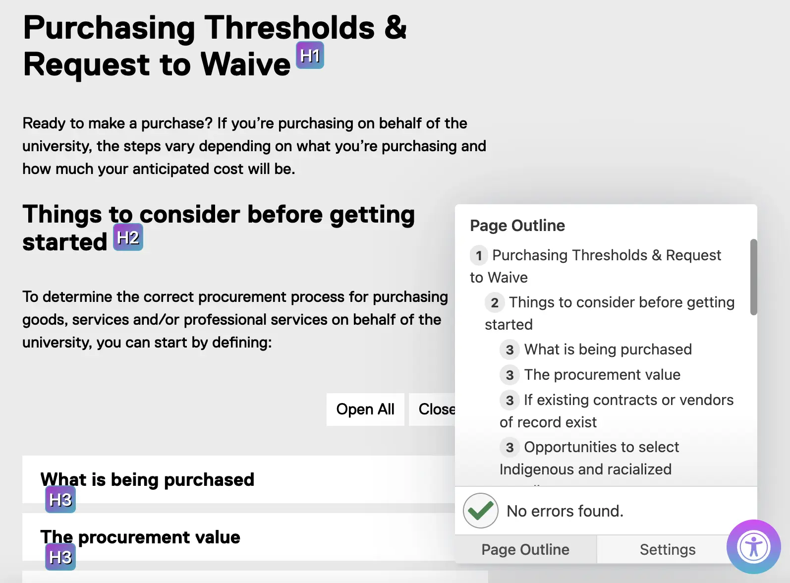
Example of a webpage using headings correctly
The annotated box shows an outline of all the headings on the page, similar to the table of contents for a book. It gives you a visual idea of how each part is interconnected!
Heading font size within footer section of inherited content
- Heading 2 = 1.2em
- Heading 3 = 1.1em

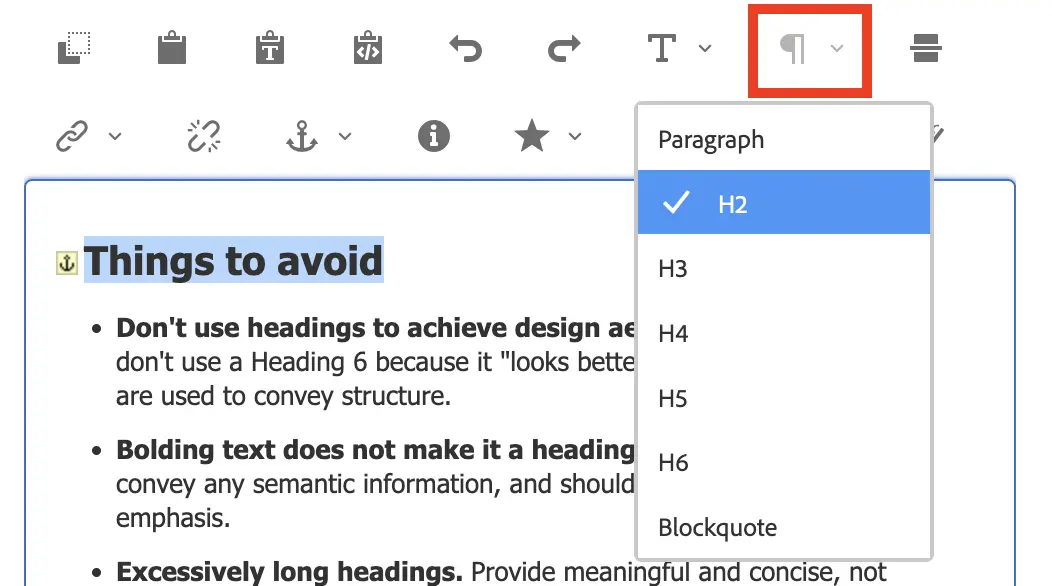
Things to avoid
- Don't use headings to achieve design aesthetics. For example, don't use a Heading 6 because it "looks better" - remember, headings are used to convey structure.
- Bolding text does not make it a heading. Bolded text does not convey any semantic information, and should only be used to provide emphasis.
- Excessively long headings. Provide meaningful and concise, not long and wordy.
- Don't skip headings.
Relevant WCAG 2.0 Success Criteria
Using heading structure in a meaningful way is a combination of various Level A and AA success criteria, which is required for conformance with WCAG 2.0 and the Accessibility for Ontarians with Disabilities Act (AODA).
- 1.3.1 Info and Relationships (Level A): (external link) Information, structure, and relationships conveyed through presentation can be programmatically determined or are available in text.
- 2.4.6 Headings and Labels (Level AA): (external link) Headings and labels describe topic or purpose.
- 2.4.10 Section Headings (Level AAA): (external link) Section headings are used to organize the content
