Accessibility checker
Need help?
If you are experiencing any issues with the accessibility checker, or need assistance improving the accessibility of your website. Please contact:
Adam Chaboryk
IT Accessibility Specialist, Digital Media Projects, CCS
adam.chaboryk@torontomu.ca
About
The in-page accessibility checker will instantly check your page for accessibility and usability issues when enabled. The tool checks for content issues such as images missing alternative text, non-descriptive hyperlinks, poor heading structure, incorrect use of components and much more.
Errors or warnings will be indicated exactly before or after where the issue is detected. The error message will be displayed in a convenient tooltip on how to fix.

Getting started
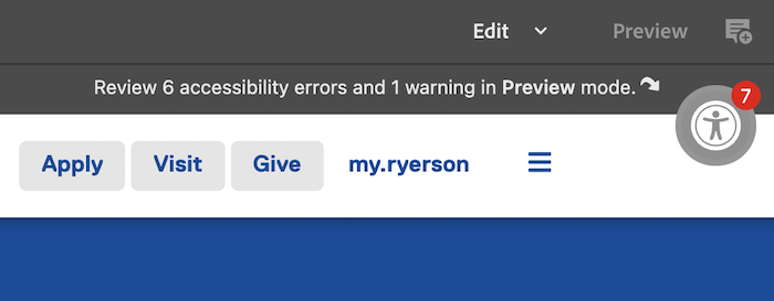
The accessibility checker toggle is located in the top right corner and only works in Preview mode. In Edit mode, the accessibility checker is disabled and grayed out, as shown in the image.
- Press Preview.
- Toggle the accessibility checker on.
- Correct any highlighted issues (if any).
- Once enabled, click the "Outline" button to get a visual idea of how the page is structured. Adjust heading structure if necessary.
- Toggle the accessibility checker off and on if you make any page edits.

Errors
Critical accessibility and usability issues are detected on your page. The checker highlights common WCAG 2.0 Level A and AA accessibility issues.
Anything flagged as an error must be fixed.
Warnings
Potential accessibility and usability issues detected. Warning messages may:
- Prompt you to manually review the element.
- Provide suggestions to improve the usability/accessibility.
- Warn you of accessibility issues that cannot be programmatically detected.
Pass
No accessibility or usability issues were detected.
Please note: Accessibility barriers may still exist, however it is not possible to detect all barriers with an automated tool. Even the best automated accessibility tools can only detect up to 40% of all issues! Accessibility is about human experience.
Outline
The Outline tab displays the page's heading structure, similar to the table of contents for a book, gives a visual idea of how each part is interconnected. Headings should always be structured in a way that conveys hierarchy. Headings should never skip levels.
Learn more about heading structure.

Images
The Images tab makes it easy to review all images and their corresponding alt text within a page for accuracy and quality. This tab helps with images that may be temporarily hidden, like those in slideshows.
Images that were uploaded to the DAM will include an "Edit" link, which includes a shortcut to add alt text to an image.

Settings
The Settings tab has additional settings and features.
Readability
The readability feature calculates the readability score from all paragraph and list content within the main content area. The readability score gives you an idea on how easy it will be for someone to read your page. It is based on the average length of sentences and words on your page, using a formula known as the Flesch reading-ease test. The readability score will appear in the Outline panel. Some notes about the readability score:
- A "good" or recommended reading score is between 60 and 100, and is an indication that the writing is understandable and easy to digest.
- Sentences that are too long negatively impact the readability score.
- Words with many syllables are considered a complex word.
- A "good" reading score is not required for AODA compliance. A low score does not affect the pass or fail state of the accessibility checker.
To improve the readability score of a page, check out: Writing for the web: best practices.
Appearance
Use the appearance options to change the theme and position of the accessibility checker.
Colour filter
Colour filters let you simulate various colour vision deficiencies (CVD) within a page. Use these colour filters on maps, charts, graphs, and other elements. Check for elements that are difficult to perceive or distinguish against other colours.

Dismiss annotations
Some tooltips feature a "Dismiss" or "Dismiss all" button. This feature gives content editors the ability to temporarily dismiss any “good” or “warning” annotation on a page while they are working.
Dismissed annotations are unique to the web page you are editing. Dismissing a single warning will not dismiss every instance of that issue across your website. This feature uses your browser’s local web storage (a type of cookie) to “remember” which warnings you dismissed. If you clear your browser’s cookies, all dismissed alerts will be restored.
To restore all annotations, select the "Show dismissed" () button.


Alternative text quality
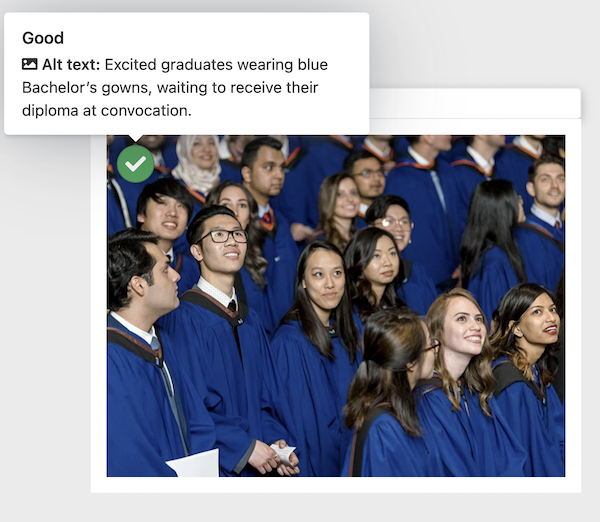
Pass () buttons will appear on images that are marked as decorative or have alternative text. The popup will include the alt text defined to help you ensure it is descriptive, concise and makes sense based on the surrounding content. Pass messages will also appear on:
- Images that are marked as decorative.
- Components that are setup in a way that facilitate good accessibility.

Page usability
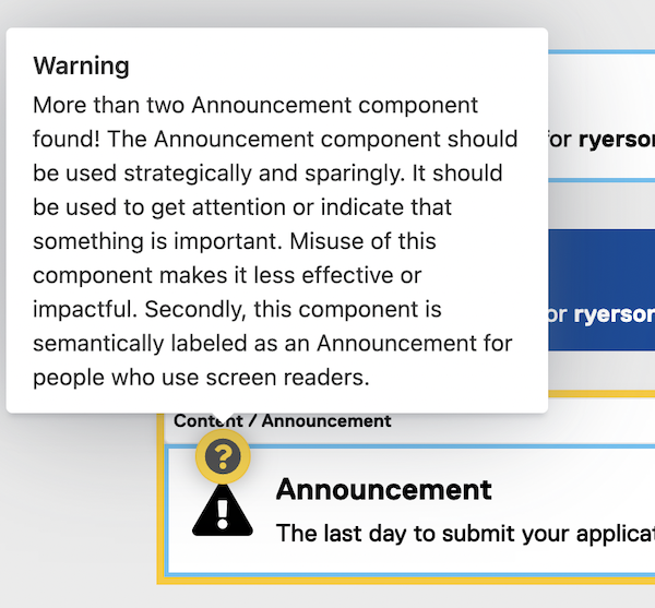
Warning () or Error () buttons may appear on components that are being used ineffectively and will recommend you to improve for accessibility/usability. Buttons may appear on:
- Interactive components nested within other components.
- Component settings that may cause usability issues.
- ...and more!
The Overlay Text option is the easiest way to make a hyperlinked image more accessible and usable.
- For usability, it is visually clear that the image links to another page because of the decorative arrow (without having to guess or hover over the image to see if it’s clickable).
- For accessibility, the Overlay Text is used instead of the predefined alt text to ensure that the linked image accurately describes the destination page. It also reduces the amount of hyperlinks on the page since it wraps a single anchor around both the image and text.
Otherwise, if you choose to not use the Overlay Text option, you need to make sure that the alt text of the image describes where the hyperlink takes you. For example, if you have a picture of hockey players and the link takes you to the TMU Bold website, the alt text should be “TMU Bold” instead of “Group of hockey players”. Whenever you use an image as a hyperlink, you change the function or purpose of the image.
People who use screen readers are not warned when a page opens in a new window. This may cause confusion if they try to go back a page. Secondly, it's not good practice to control a user's experience or make decisions for them.
When is Open in new window okay? The only times where it might be necessary are pages containing context-sensitive information such as a form for example. If there are some help instructions on another page, than opening that link in a new tab might be good as it would not reset the page while someone is filling it out. Otherwise warn users by including the words (Opens in New Tab) within the hyperlink.
Relevant articles
- Usability: Should links open in new windows? (external link) (Source: Smashing Magazine)
- Accessibility: Opening new windows and tabs from a link only when necessary. (external link) (Source: W3/WCAG 2.1)
- Accessibility: Giving users advanced warning when opening a new window. (external link) (Source: W3/WCAG 2.1)
Under the WCAG 2.0, PDF files are considered web content and become an extension of your website. If the PDF file is a form, consider using the Adobe AEM Forms component or Google Forms as an accessible alternative. If the PDF file is a document, consider converting it into a webpage instead.
As a friendly reminder, this warning will appear on every page containing a PDF. We strongly encourage you to use a medium that facilitates better accessibility, usability and readability. Using a website as opposed to a PDF is much more accessible, customizable, responsive (good for mobile - no need to pinch and zoom), more readable, and easy to update!
All pages that contain a video will get a warning message. If your video or podcast does have closed captioning or a transcript - simply ignore the warning message.
All videos on your website must have closed captions. All audio content such as podcasts must have an accompanying transcript. This is a WCAG 2.0 Level A requirement.
Note: The automatically generated captions on YouTube are rarely accurate and do not meet minimum acceptable standards in most cases - however, they can be easily edited/corrected!
Limitations
- Does not automatically fix issues for you.
- Does not check for broken links or spelling.
- Does not crawl your entire website. The tool only checks for errors on a page-by-page basis.
- Does not instantly re-check when you make a change. You must toggle the button to re-check the page again.
- Does not guarantee your site is accessible or WCAG 2.0 Level AA compliant.