You are now in the main content area
Column Layout Component
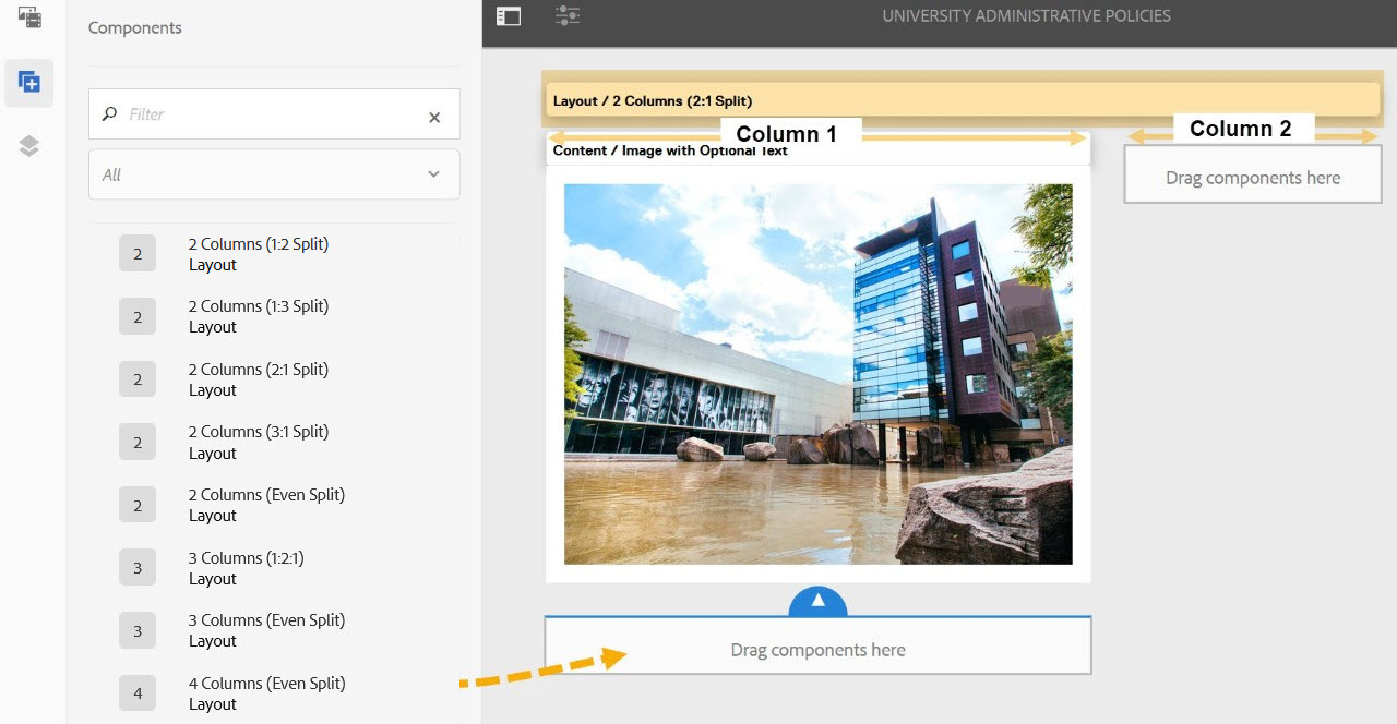
Columns are used for page & content layout.
- Found in Side Panel > Components > Columns
- No custom colours applied
- All other components can be added to column components
- Columns can contain multiple components
- White background option available in the Columns component
- There are eight column components available:
- 2 Columns (1:2 split) layout
- 2 Columns (1:3 split) layout
- 2 Columns (2:1 split) layout
- 2 Columns (3:1 split) layout
- 2 Columns (Even split) layout
- 3 Columns (1:2:1) layout
- 3 Columns (Even split) layout
- 4 Columns (Even split) layout
- 2 Columns (1:2 split) layout
- Mobile 2-column option available in the following components:
- 2 Columns (1:2 Split)
- 2 Columns (1:3 Split)
- 2 Columns (2:1 Split)
- 2 Columns (3:1 Split)
- 2 Columns (Even Split)
- 3 Columns (1:2:1)
- 3 Columns (Even Split)
- 4 Columns (Even Split)
Similar content:
How to use
- Select the "Side Panel" button in the top left corner of page
- Select the components button on the left
- Select the Columns layout suitable to your content (2 Columns, 3 Columns, etc.)
- Drag that Columns component onto the page
- Add components by dragging them from the side panel to a column