Production Guidelines
Navigating the world of print production can be challenging, especially for students new to the field. This page is designed to provide you with essential guidelines and best practices to help you produce high-quality print materials.
From understanding color modes and resolution requirements to selecting the right paper and finishing techniques, these tips will equip you with the knowledge needed to bring your creative projects to life. Whether you're working on brochures, posters, or business cards, our comprehensive guide will ensure your print designs are both professional and polished.
Let's get started on making your print projects a success!
Page compiled by Max Berardi and Christopher Smyth.
Crop marks, also known as trim marks are added to a design before printing, and are the indication of where the final cut is. They are lines or ticks printed in the corners of a sheet or sheets of paper to show where the job needs to be trimmed.
We print on oversized paper to account for bleed. Crop marks guide us when we trim the final print job down to its required dimensions.
Avoid designing your bleed beyond where the trim marks will be. You can add crop marks to your design when saving it as a PDF through programs like Illustrator and InDesign.
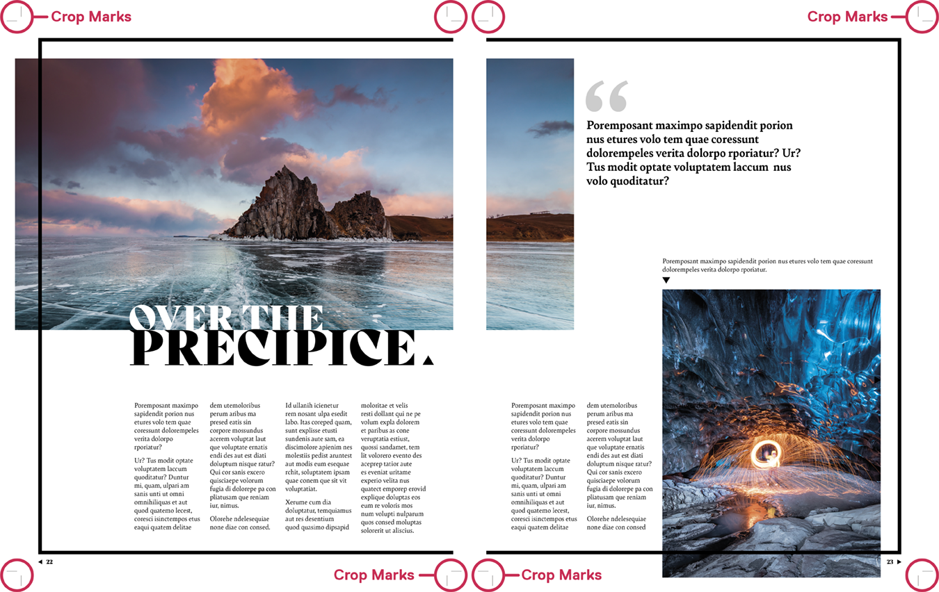
Layout of a magazine with the crop marks in each corner highlighted.
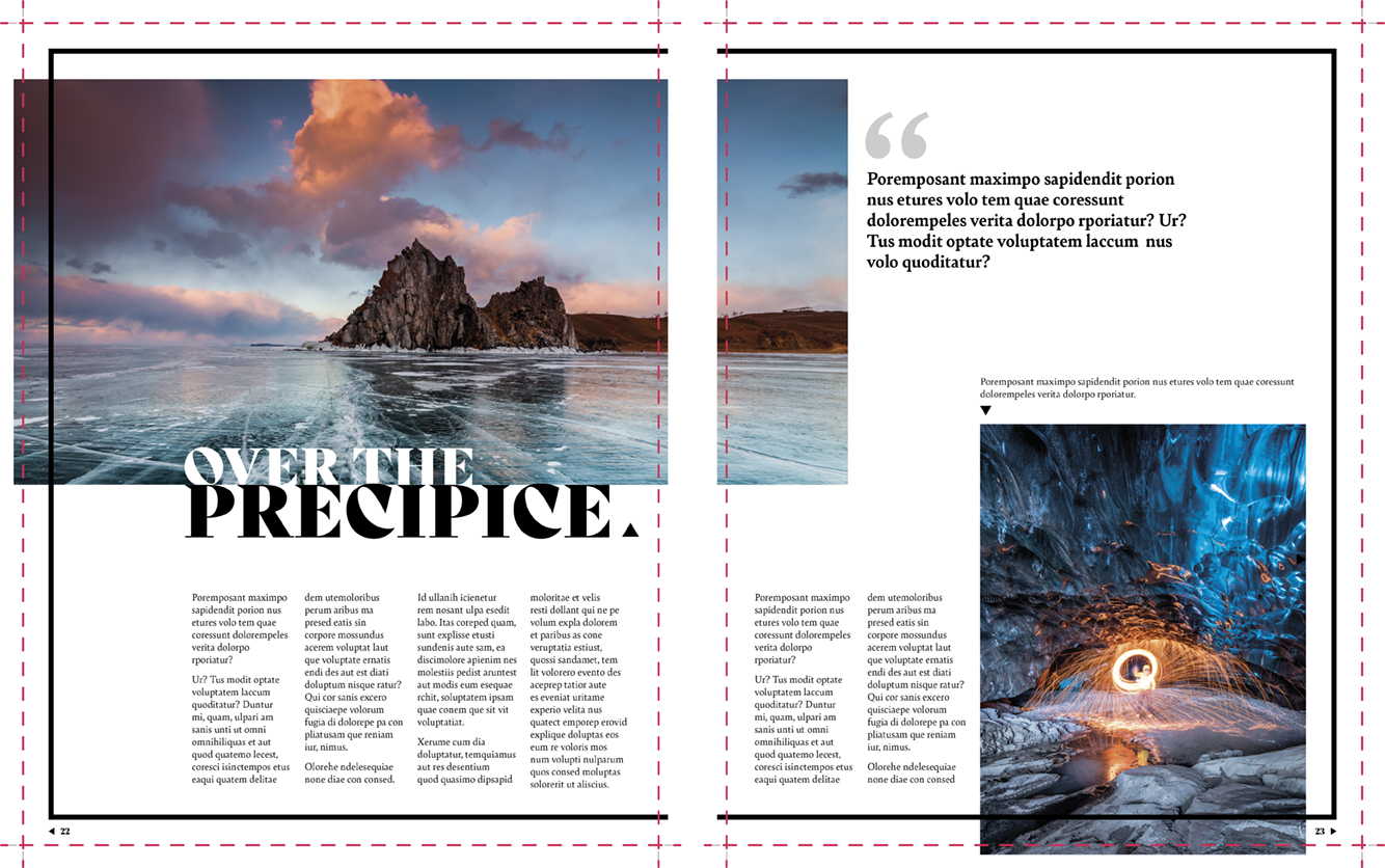
Layout of a magazine with highlighted lines showing where each cut is going to be made across the entire sheet.
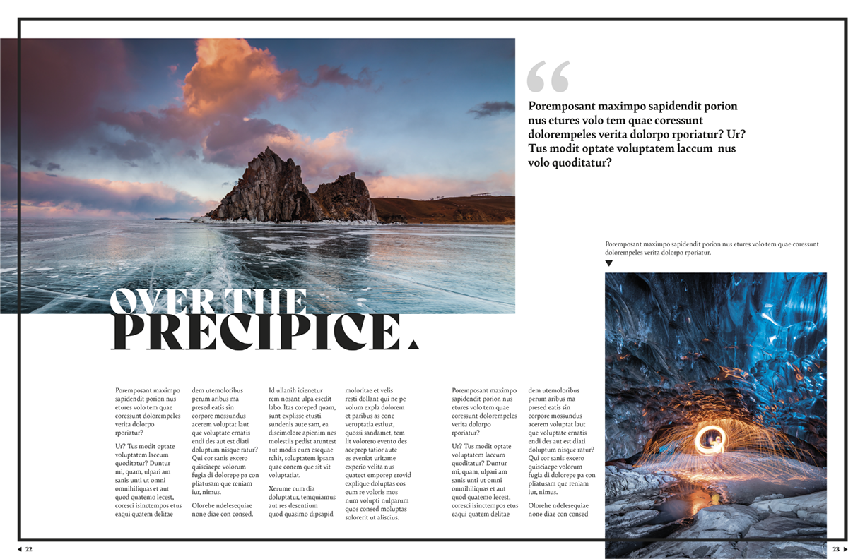
Layout of a finished magazine showing what it would look like after each cut is made.
File naming or versioning is key when working with digital files. Naming your files with the proper conventions helps to organize your workflow. Clear, consistent, and organized filenames are core to building a happy workflow - it lets designers collaborate, share with others, send files to clients, and even helps with invoicing. It provides structure, which is essential for automation - it helps save time and reduce errors. If you’re working on a project, you’ll probably be provided with the proper naming conventions. If not - ask.
When naming your files, they should have no special characters - or underscores, ever. Files with certain special characters may not save correctly, files being deleted, or not being able to be accessed as these special characters are reserved for specific functions in file systems. File names should be long enough to include information required, but generally don’t exceed 32 characters.
The Dos of File Naming:
Do…
- Include a unique project number - this is the ‘purchase order’ number, and is used to track all costs to a specific project.
- Client and/or brand name
- The name of campaign
- Channel of the campaign
- Name of a differentiating element (audio, image, layout, video…)
- If you need date information, it should be yyyy-mm-dd. This will help avoid confusion, and allow it to sort correctly
- Version number
- Use a number system, such as v1.1, or v2.3 - the first number for major revision, the second one for minor revisions.
The Don’ts of File Naming
Do Not…
- Use any special characters or spaces in the name - this may negatively affect visibility and cause extra difficulties when searching. Certain characters are often reserved for specific functions (commands) in file systems, such as: /, , :, *, ?, ", <, >, |, ~.
- Add underscores (hyphens and dashes (without spaces) - are fine). This is because search engines ‘read’ hyphens in file and folder names as spaces between words. Underscores are not recognized, meaning that their presence makes things like keywords difficult to find.
- Use double digits for numbers, for example 01 instead of 1
- Differentiate file names using upper and lower case characters
- Use any of the following “forbidden” words: edited, fixed, updated, new, or final - this causes confusion. The ‘final’ version is moved to a folder named ‘release’ or of the like.
Example of a good filename:
Unique ID Number-Client-Brand-Channel-Major Version-Minor Version
315-PnG-Tde-Print-v02-1
Assets of a Good Filename
A unique ID number is the number designating what each project is in the company’s database. A client is the larger organization such as Procter & Gamble. The brand is the product such as Tide. The channel is the final media output this project will be made for such as print. The date you should always use year/month/day since that will automatically sort by date when you sort alphabetically. The Major Version is the version number of the greater overall project and is always two characters. The Minor Version is added when changes are made or new features added to the project, it is only one character.
Example of what NOT to use:
.030_Tide_Procter&Gamble_Print_10_28_13_final_final
An example of what you might use in class would be:
GCM110-MBerardi-Module1-v2
Video of a file within a folder displayed in Finder. An incorrectly named file (030_Electra_Air_Canada_TV_10_28_13_final_final) is renamed with the correct file naming conventions. For each section of the file name, a blurb appears explaining what each one means. A Project Number is the unique IQ number. The Client Name is an abbreviation of the client you are working with. The Brand Name is an abbreviation of the product you are making. The Channel is the final media output. The Major Version is the number of the greater overall project. The Minor Version is added when changes are made to the project.
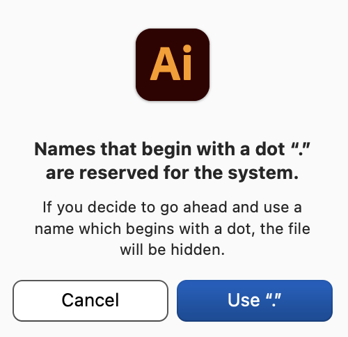
A pop-up from Illustrator prompting the user: “Names that begin with a dot “.” are reserved for the system. If you decide to go ahead and use a name which begins with a dot, the file will be hidden.”
After files are named, an organized folder structure is important. Keeping a well organized folder structure is very important, otherwise you risk looking unprofessional or even causing unnecessary delays to the project itself. Time is precious and if someone on your team has to waste time on finding the latest version of your main working file, client materials, proofs or editable elements you will be incurring extra expenses for your company and clients.
The “inside” of files should be properly ordered as well, consider naming conventions for your layers in Adobe apps, as well as comments in code, instructions and notes in your layout files. At times, you will be asked to collaborate with another designer, share your files with a printer or even send your files to some of your clients.
If you’re working on a project, you might be provided with the proper folder organization, but as always, if not - ask. With your own personal folders, ensure you always follow the same structure so that you know where each and every file would and will be. Every design discipline is different, tweak the names of your folders to best describe their purpose and enclosed files.
Tips and Tricks
- Use a proper naming convention for your files, don’t name your files “Project-Final”. Use version numbers instead “Project-v6”.
- Get a backup system in place. Investing in an external harddrive or time machine can save all our files on an hourly basis.
- The names of your folders should best describe their purpose and enclosed files.
- Save your work regularly
- Keep file names short but meaningful
- Avoid using special characters such as ?!@*%{[<>)
An example of a good format for naming your files would be
- Date (date format should be YYYY-MM-DD)
- Researcher initials
- Project identifier
- Description of content
Image resolution refers to the level of detail contained in an image, specifically the number of pixels. The higher the resolution, the higher the pixel count, which results in a more detailed image. This is a term you will deal with in any digital work where you are using images.
Different outputs require different pixel counts as well. Outputting an image for screen uses a standard of 72 pixels per inch while 300 dots per inch is the standard for high-quality print.
An important note is that screen image resolution is measured in pixels per inch, referring to the number of pixels on the screen. Meanwhile, print image jobs are measured in dots per inch, referring to the number of ink droplets a printer produces per inch.
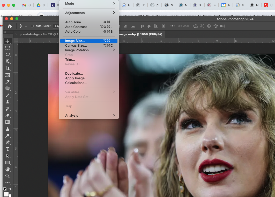
Image of Photoshop. You can check resolution in Photoshop, open an image in the toolbar, and select check image size.
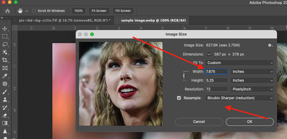
Image of Photoshop. When readjusting the image size you can change the width, height, and resolution of the original image as well as resampling. The image is 72 ppi as this is an image designed for web usage. Changing the resolution from 72 to 300 doesn't help, it will make a high resolution poor quality image, it won't 'look' good when actually printed.
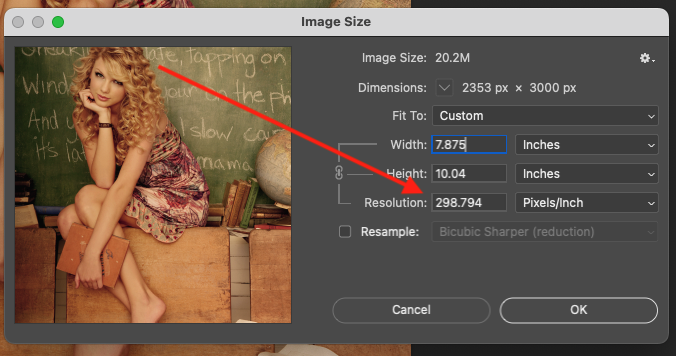
Image of Photoshop. As opposed to the previous image, this image’s resolution is 300 ppi and the quality is much better. This is an image designed for print.
Video of a Photoshop file showing how to check the resolution of an image. Open your image in Photoshop. Click on Image>Image Size. View the resolution section.
In print jobs use the four process colours, cyan, magenta, yellow, black (CMYK) and for digital jobs we use the RGB colour model, red, green, and blue. All RGB have to be converted into CMYK for print, which can lead to an unexpected colour shift.
We deal with many kinds of black in our industry with the four listed below being the most important.
- Black produced on screen using RGB is called true black.
- Black produced using just black ink (K) is called standard black or process black
- Black produced using all four CMYK colours is called registration black. You should never use this as it wastes ink and plates may not be aligned so your job may be misprinted.
- Black produced using only 50% of cyan, magenta, and yellow and 100% of black is called rich black. This is used in printing to enhance the richness of standard black without wasting too much ink and with less room for error.
Before you print you should always preflight your job and check the CMYK values. One way to check is to use Adobe Acrobat’s ‘Output Preview’ tool found in its ‘Print Production’ menu. K on its own should always have a support colour.
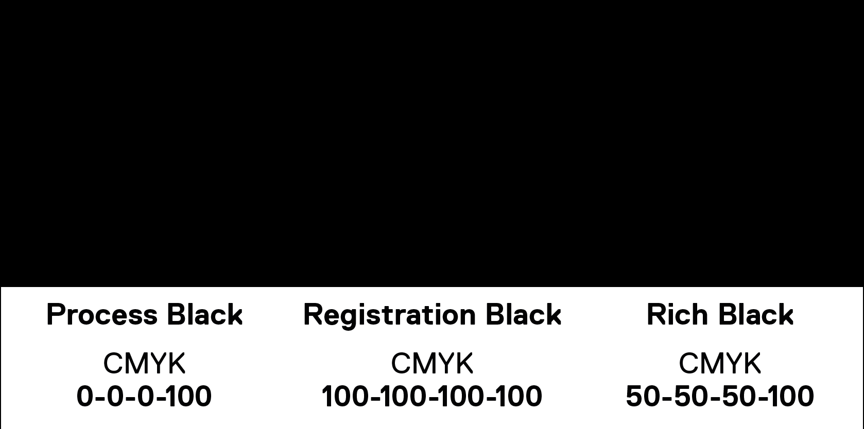
True Black, Process Black, Registration Black, and Rich Black are all pictured in a row, labelled with their respective RGB and CMYK values. They are all reproduced in RGB. They are nearly indistinguishable.
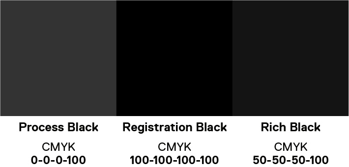
True Black, Process Black, Registration Black, and Rich Black are all pictured in a row, labelled with their respective RGB and CMYK values. The print preview has been turned on and the blacks are pictured accurately how they would be reproduced in CMYK.
Every object in your documents when printed will either be overprint or knockout. When designing for print you will have objects placed or layered on top of one another. The default for many programs is knockout. This means that the top object’s colours are the only ones printed. That object masks all the background elements and “knocks them out” meaning nothing is printed underneath. Overprint means that they will mix with those of the background, creating new colors as the colors are blended. Using overprint means the elements “print over” each other.
Adobe Illustrator and InDesign have knockout turned on by default. You can change this in the ‘Attributes’ window by selecting an object and checking off ‘Overprint Fill’ or ‘Overprint Stroke’ to toggle between overprint and knockout. You can also use the ‘Overprint Preview’ window to see what the design will look like when it is printed. In InDesign, the black swatch automatically prints overprint by default.
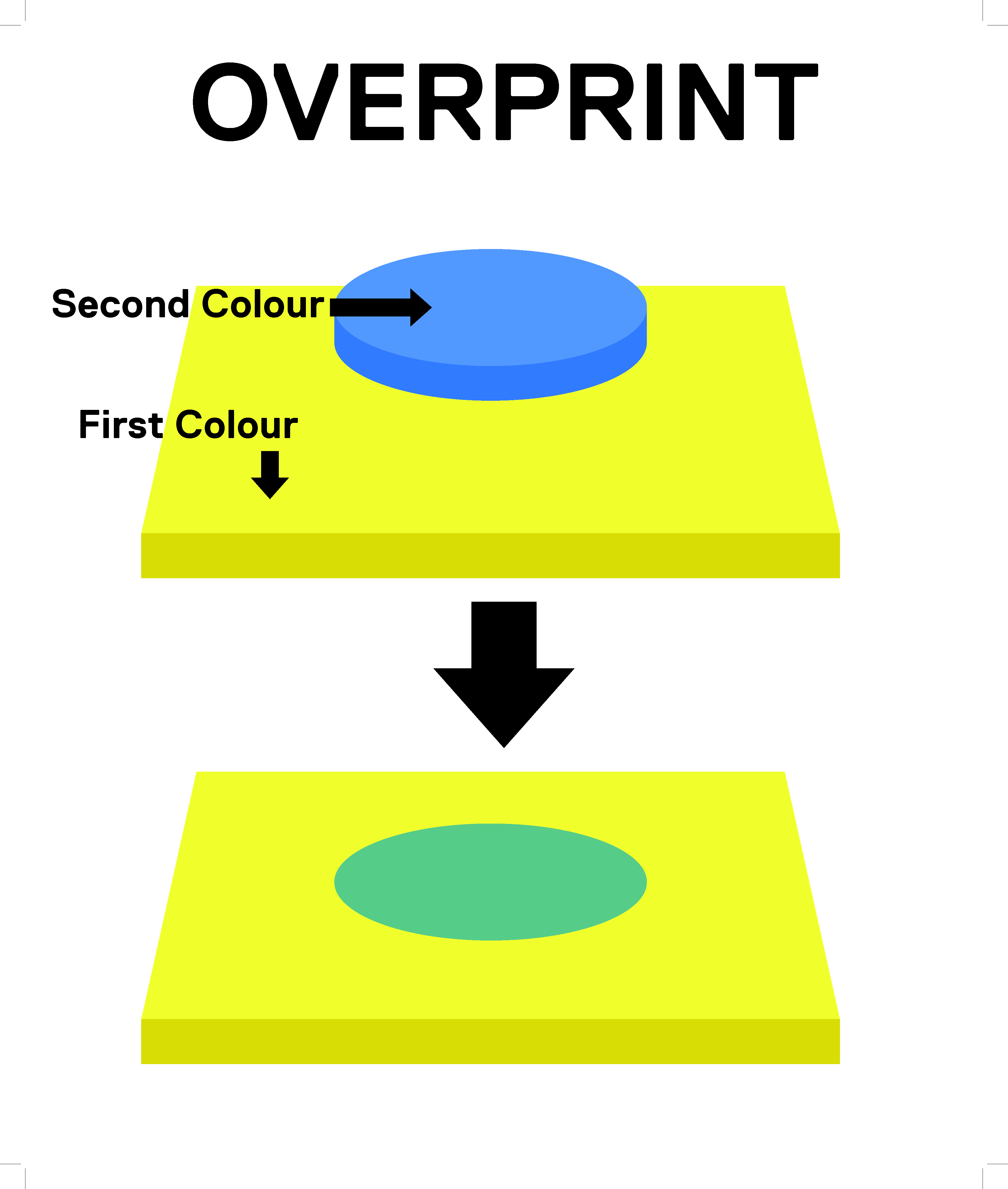
Image of an Illustrator file. Overprint: Overprinting the cyan shape on a yellow background results in a colour change to green.
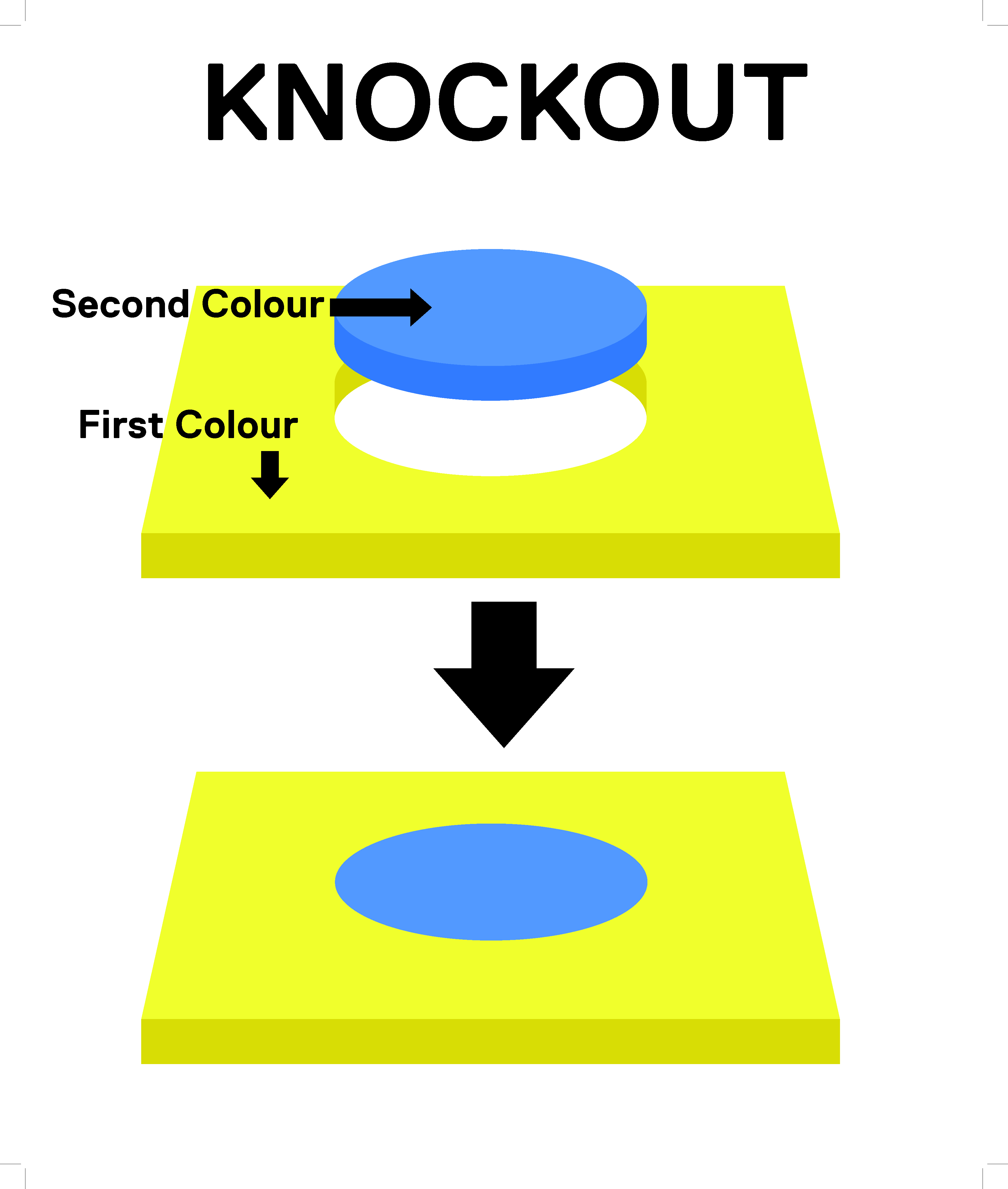
Image of an Illustrator file. Knockout: The cyan shape does not overprint on the yellow background, keeping its blue colour.
Video of an InDesign file how to turn on overprint preview and separations preview, demonstrating what overprint fill looks like. To turn on overprint fill go to Windows>Output>Attributes and select the ‘Overprint Fill’ box. To turn on separations preview go to Windows>Output>Separations preview and in the ‘View’ dropdown, select ‘Separations’.
When counting paper we count page positions, meaning we count the number of printable sides. So one piece of paper is counted as having two pages because it has two printable sides. Pages must be divisible by four.
When printing brochures or books, we are able to impose them and print multiple signatures on each page. A signature is a sheet that is folded at least once as part of a book, magazine or brochure.
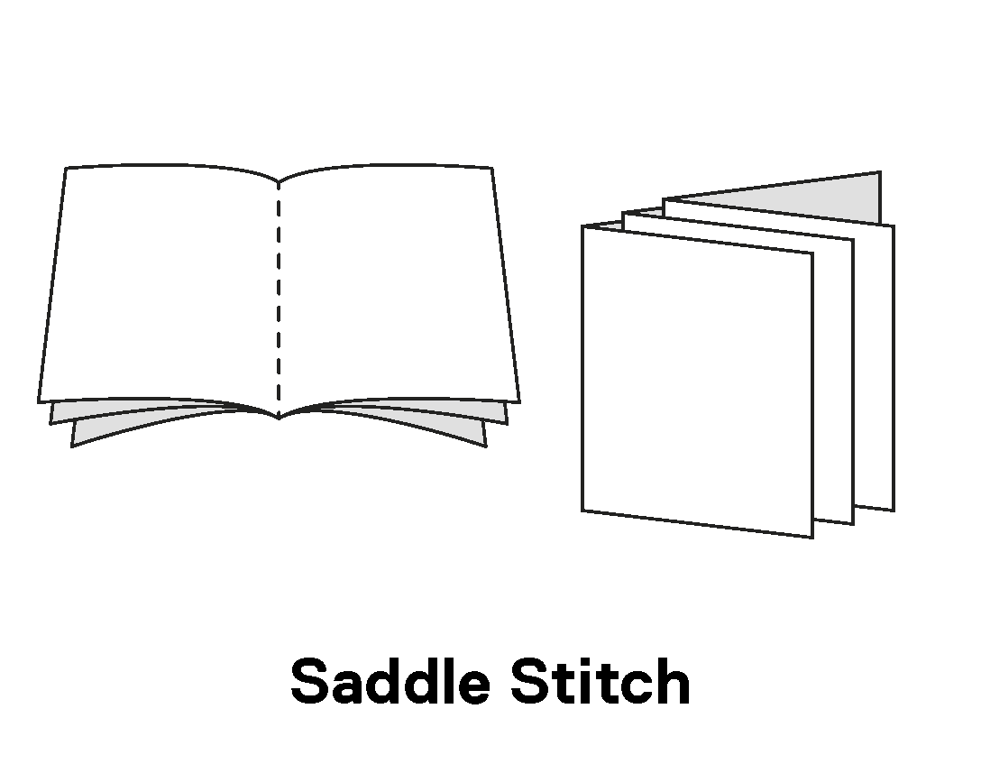
An image demonstrating how pages are collated for saddle stitch binding. The sheets are folded, gathered, and bound together down the fold-line, pictured as a dotted line along the middle.
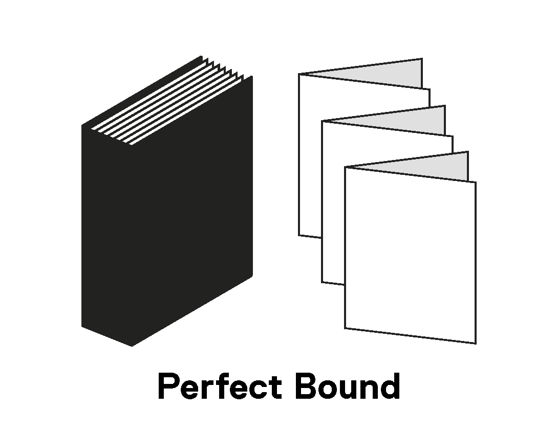
An image demonstrating how pages are collated for perfect binding. With this method many small booklets are made then gathered side-by-side, cut, and bound together.
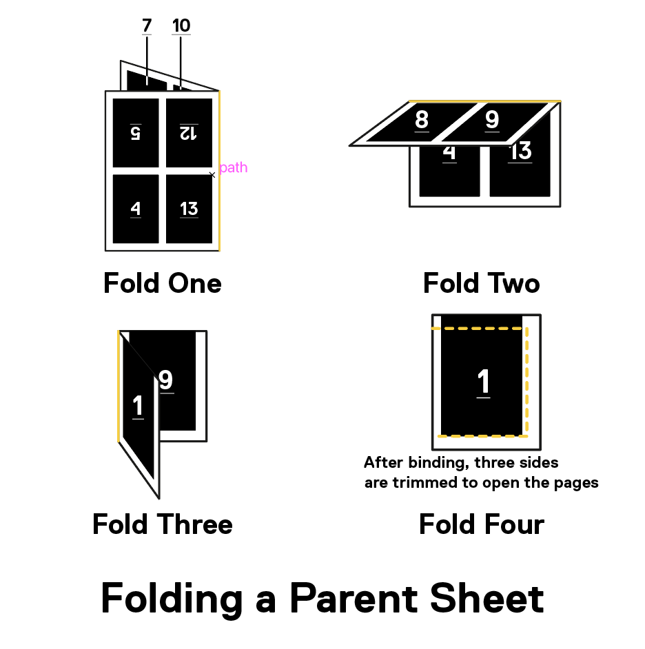
An image demonstrating how folding a parent sheet works. Signatures 1 through 16 are on one sheet of paper. When folded in the correct manner, the pages will all line up properly. The first fold is in the centre of the page length-wise, folding away from itself. The second fold is in the centre height-wise, folding in on itself. The third fold comes again length-wise, creating a small booklet. The final step after binding, three sides are cut to open the book.
Type safety, also known as text safety, live area, and safety area, is used in printing and is the area in your design where all essential text and images should be placed. Text is placed inside this area to prevent information from getting cut off when a job is trimmed.
If you place the text frame too close to the edge of the page, it may be partially trimmed and lead to disappointment as the text may become unreadable. A live area is used to avoid any unintended consequences in terms of text legibility.
The exact measurement of the live area may differ depending on the job, but it is best practice to place any and all essential text at a minimum of 0.25 inches from the border of the page.
Video of Adobe Illustrator. Type Safety is written in large text and is off the artboard, when trim view is turned on, parts of the text are cut off. The text is moved to fit within a border 0.25 inches from the edge of the artboard. When the trim view is turned on, the text is now fully visible.
