open/closed : rooms/corridors
Vendor Booth Market
Project Description
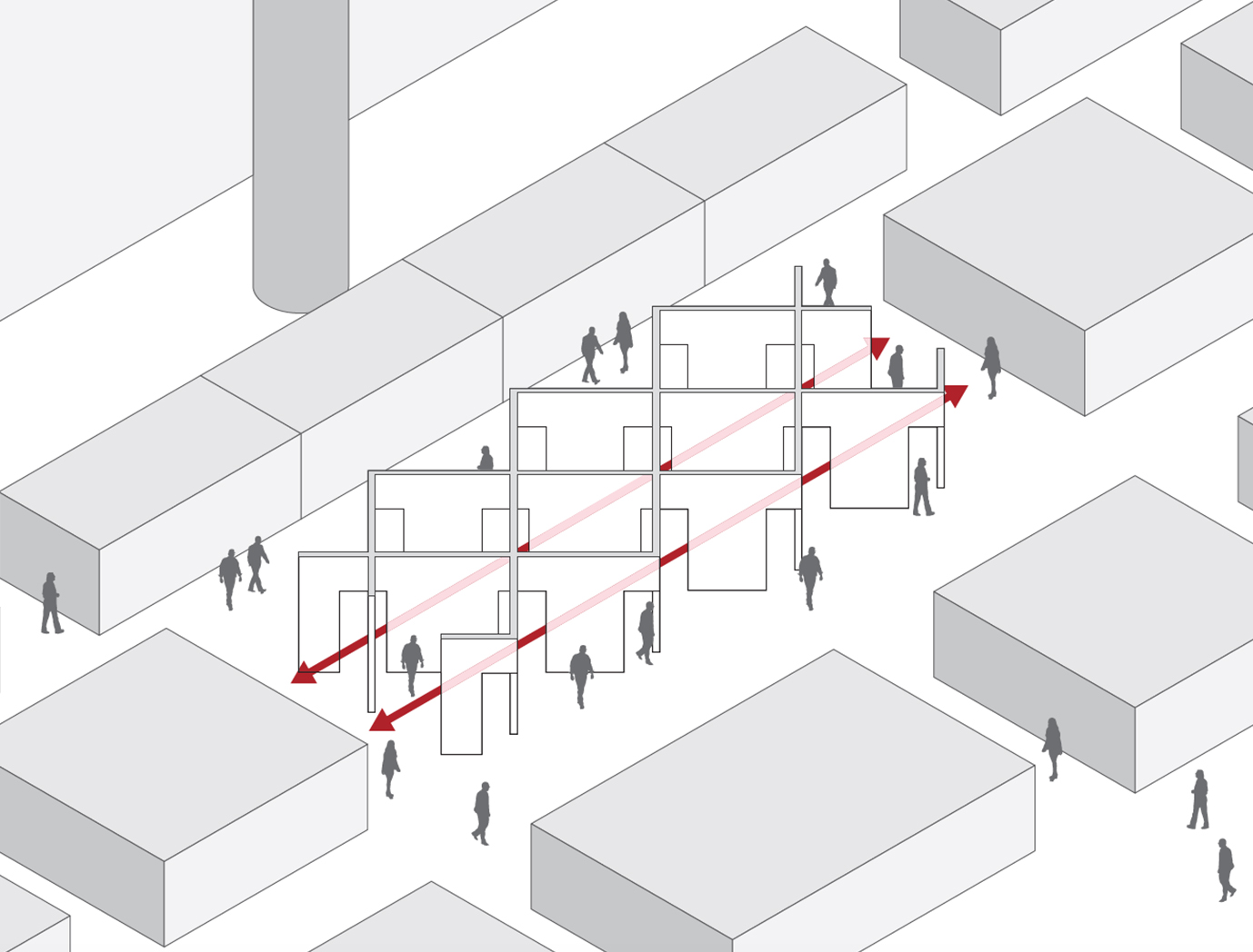
This design/build project examines the reshaping of the typical user experience of a trade show by rethinking the relationship between booth and corridor; between wall and door; between room and circulation; and between inhabitation and movement. The first modern trades show, Great Exhibition of 1851 (Crystal Palace, London, UK), established the double-loaded corridors—flanked by independent booths and has since been the central organizing feature of the interior architecture of tradeshows. However, learning from 14th to 17th-century interiors, our project, a 50’ x 20’ booth for 18 independent vendors, reframes the the function of the corridor in modern interiors.
Strength of Aesthetic Value
Architectural historians have argued the modern corridor emerged in the 18th-century as a reflection of their “new status as a colonial empire, namely, speed and connectivity” (Jarzombek, 764) as well as new and growing sensibility and importance placed on the notion of privacy (Evans, 70). Before the corridor, Italian Palladian and French Beaux- Arts traditions established circulation through a series of rooms where the most desirable spaces had the greatest number of openings (Evans, 64). Circulation was not seen as a pejorative space or as traffic, but rather an essential part of the inhabitation and experience of space itself. Examples include Palazzo Antonini, Udine by Palladio in 1556, Villa Madama in Rome by Raphael, and Antonio da Sangallo the Younger in 1525. This understanding and framing of circulation as inhabitation became the starting point for our design-build project for an international design tradeshow.
Ingenuity or Novelty
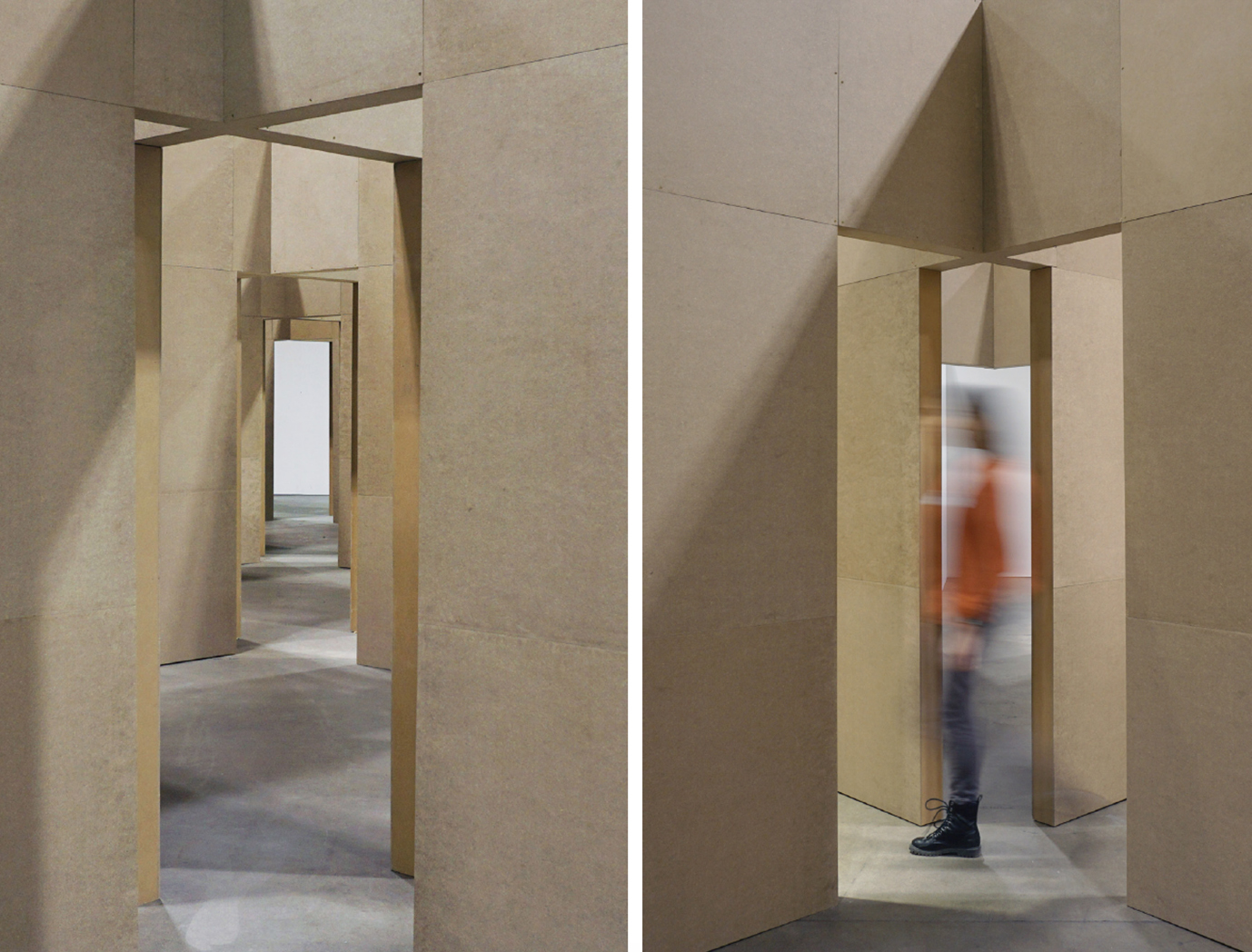
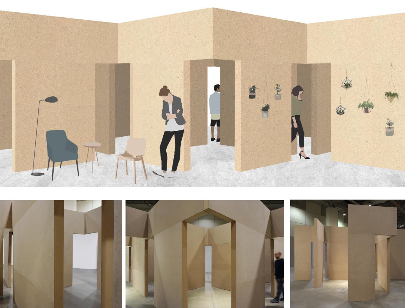
Reinventing the modern corridor as well as rethinking the 16th-century enfilade circulation, our design reimagines and recombines walls, openings, and paths to produce a series of corridorish rooms and room-ish corridors. Drawing visitors in from the main circulation path, the 20’ x 50’ booth invites visitors to move freely through the interconnected booths. Here, movement has become the primary experience itself, blurring the hierarchy between served and service spaces, traffic and place, travel and destination.
Visual Presence
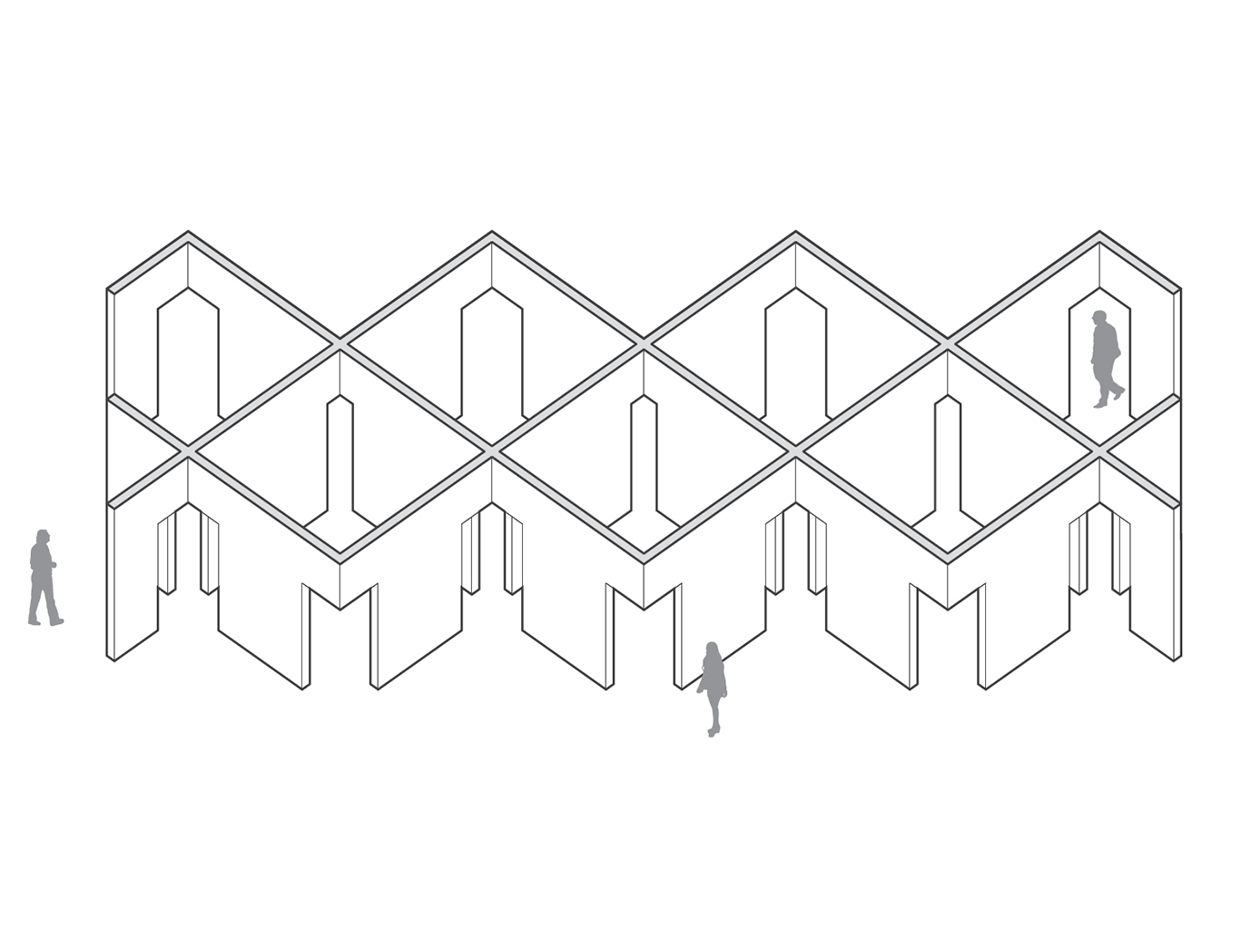
The visual presence of this blurring is archived by beginning from a standard grid of 10’x10’booths and cutting openings at the intersections of walls. While the quality of a room in the 16th-century was evaluated based on the number of openings, we assessed the placement of opening to maximize the number of rooms that could be connected through a single opening. Thus, allowing visitors to move seamlessly between booths in a multitude of directions. Theseestranged corner openings produce a strong and uncanny visual presence; they are at once strange and familiar. They simultaneously disrupt conventional notions of inhabitation versus traffic (unfamiliar) while maintaining a conventional series of linear paths (the familiar corridor). While the booth is composed of conventional elements (doors, walls, and corridors), the unconventional combination encourages meandering, lingering, and encounters amongst visitors and vendors.
Mastery in Craftsmanship
The design-build process combined ‘thinking’ with ‘making’, ideas with craft, and design with its realization. The project was designed, built, and installed by a team of two faculty and four second-year interior design students. The walls were fabricated by CNC cutting plywood torsion box systems, which were then skinned in 1/4” MDF. All walls were screwed, on-site, to an ‘x’ shape unit that structurally reinforces and ties together the system while providing the numerous openings. Critical to the visual presence and structural integrity of the project was its craftsmanship in terms of how planar and square the wall panels were made. Thus, a jig for skinning the torsion boxes was used to ensure the process yielded square panels.


