Accessibility & Brightspace by D2L
Web accessibility is the practice of removing barriers and creating equal access to information and websites for people with disabilities. It is aimed to address barriers relating to visual, motor, auditory, and cognitive disabilities. Toronto Metropolitan University is committed to providing an accessible learning and employment environment for students, employees and members of the university community (Learn more about Accessibility) (opens in new window) .
D2L Brightspace follows web accessibility standards to ensure its interface is made accessible to users with disabilities and assistive technology.
Ultimately, it is the responsibility of each course designer or instructor to ensure course content is formatted using best practices for accessibility; including the use of good heading structure, descriptive link text, alternative text and more.

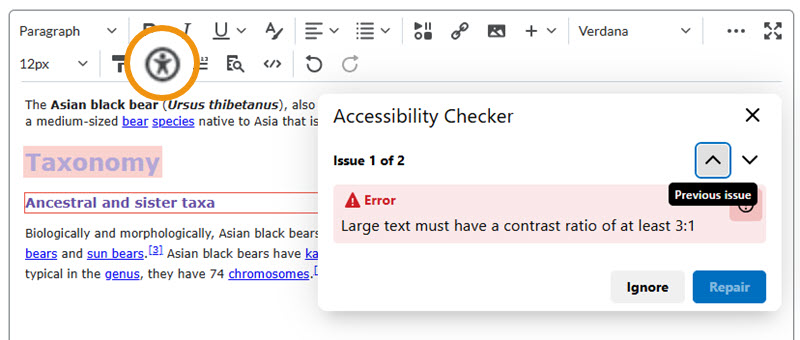
The D2L text editor, found in many tools across Brightspace, features an Accessibility Checker which highlights any accessibility issues with your content, such as: poor heading structure, poor contrast, missing alternative text and more. To run the checker, click the Check Accessibility button in the bottom toolbar of the editor.
Ensure uploaded content (presentations, PDF’s, YouTube videos, etc.) are built with accessibility in mind.
- All videos should have captions.
- Avoid using PDF files if possible; formatted HTML is much more accessible.
- If uploading PDF files, check for accessibility in Acrobat to ensure the document is tagged appropriately.
Learn more about creating accessible media and documents (opens in new window) .
When you use the "Create a File" option in D2L, you are in fact creating an HTML document. Similarly, when you post an Announcement, or even add a description to a Content item in D2L, you are creating HTML content.
As such, there are some HTML formatting techniques that you should be using in order to make your document accessible.
For more detailed instructions, please see Top 10 Tips to Increase Web Accessibility (opens in new window) .

Use Heading Styles to format content
Use Headings (H1 to H6) and ensure they flow in a logical order from most important to least important. Ensure that all tags have a proper parent/child relationship (different levels of subheadings should be underneath main headings).
- Headings should be concise, descriptive and unique.
- Don’t use a large size font or bold text to visually achieve ‘headings’.
- There should be only one H1, and it should act as the main title of the section.
- Don’t skip headings levels (e.g. H2 to H5)

Provide Alternative Text for Images
Alternative (alt) text is used to convey meaning and provide context in place of an image. Blind and low vision users rely on the alt text attribute to understand the equivalent meaning of images, figures or other graphics in textual form. When adding images in Brightspace’s text editor, use the Insert Image command; it will prompt you to add “Alternative Text” or mark the image as decorative (in the event the image conveys no meaningful context).
Hyperlinks
When inserting hyperlinks, ensure they are self-describing and meaningful. Avoid vague instructions or meanings (i.e. “click here” or “read more”), as well as pasting long URL’s. Instead, Hyperlink nouns or sentences that have specific context.
Example: Learn more about the American Black Bear (external link) .
Tables
- Avoid using tabs and spaces to manually create tables. Use the Insert Table
- option in the editor.
- Provide captions to summarize data.
- Use the Cell properties dialog to change formatting including marking row and column headers.
- When in doubt, use the Accessibility Checker to repair accessibility issues with tables.