You are now in the main content area
Buttons
The buttons component is used to add selectable and customized links to a webpage.
- Found in Side Panel > Components > Buttons
- Three styles available: Default, call-to-action, transition
- Required content: Button name, link
- Optional fields: None
- Custom Colours Applicable: Default style and Call-To-Action style
How to use
- Select the "Toggle Side Panel" button in the top left corner
- Select the Components button on the left
- Drag and drop the Buttons component onto the page
- Double click to edit
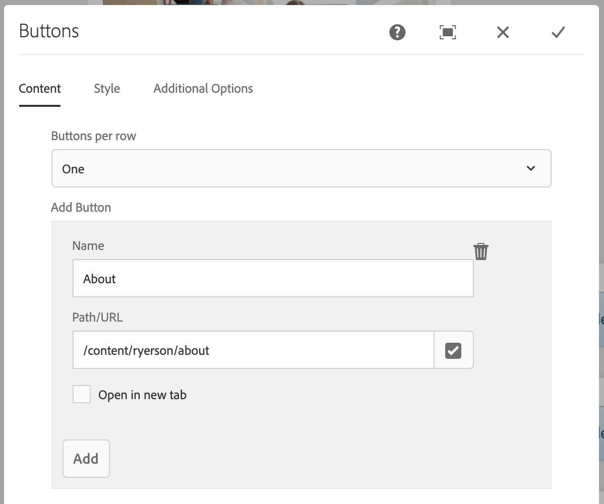
- Select number of buttons per row
- Select "Add"
- Enter "Name" and "Path/URL"
- Optional: Check off "Open in new tab"
- Select the "Style" tab
- Select Default (default), Call-To-Action, or Transition
- Select the checkmark when complete
Default style
Sample call-to-action style
Sample transition style
Display options
Choose the number of buttons that should appear in each row (maximum of four rows). This allows for the creation of a variety of layouts – vertical, horizontal and stacked.
Buttons per row:
- One
- Two
- Three
- Four
The component’s display is constrained by the amount of vertical and horizontal space it is placed in. This component’s layout will rearrange depending on the device.
For example: multiple columns on a desktop display will become a single column on a phone.
Sample button displays:
One button per row:
Two buttons per row:
