Structure & Headings
Well-structured content allows more efficient scannability, navigation, and processing. Try breaking down content into more manageable segments, while using semantic elements such as headings and lists to organize information and minimize information overload.
Headings
Headings help organize content and show how sections relate to one another. Think of headings like the titles in a book or magazine. Headings help readers make it easier to understand how the content is organized and find the information you're looking for quickly.
Effective headings
- Meaningful, succinct, and clear. Headings should be specific to the information that follows them, and clear enough so it is easier for readers to scan and find what they need.
- Consistent. All major sections of content should have a heading. Headings at each level should also maintain visual consistency in terms of size, color, indentation, and font.
- Break up blocks of text. Headings do not only provide visual cues of structure, but also are used to convey structure to assistive technology users.
- Communicate content relationships and hierarchies. It is important to make sure headings are structured in a logical order that conveys hierarchy.
- Use a Heading 1 for the title or purpose of your page or document. In most cases, a single Heading 1 should suffice, but for complex or lengthy documents, the use of multiple Heading 1s is fine.
- Ensure all headings have a proper parent/child relationship. Different levels of subheadings should be underneath main headings. For example a Heading 3 would be nested under a Heading 2.
Mistakes to avoid
- Avoid fake bolded headings. A line of bold or large text might look like a heading, but someone using a screen reader cannot tell that it is important or jump to its content. Bold or large text should never replace semantic headings (Heading 2 to Heading 6).
- Avoid skipping heading levels. Do not skip from a Heading 2 to a Heading 4, for example. It can be especially confusing for people that use screen readers, as they may wonder if they missed a section of content.
How to apply Headings
The concept of headings is universal in almost all authoring tools.
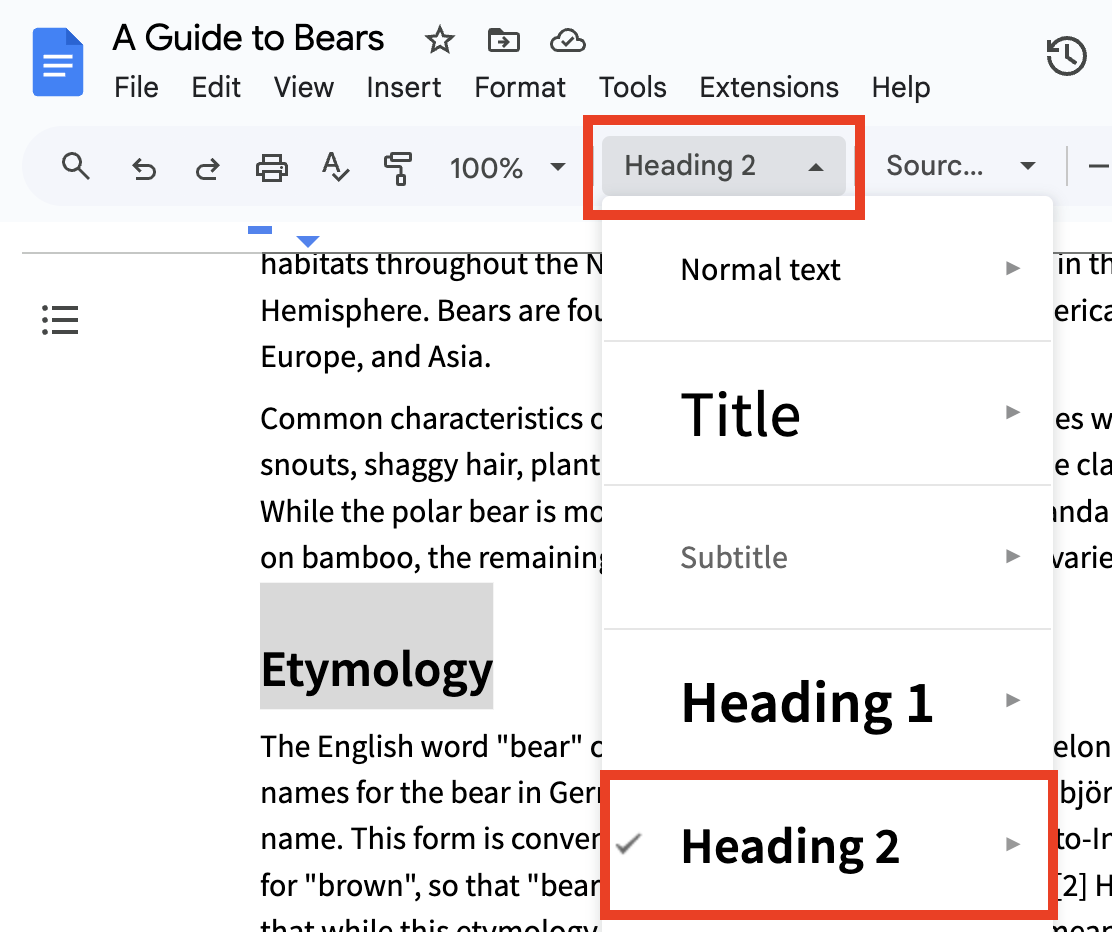
Styles button
Use the Styles button to apply semantic headings. Remember to:
- Use a Heading 1 as the main title of your document.
- Note: If a document has a cover page with a duplicate title, it is okay to use the "Title" heading format from the Styles dropdown.
- Use Heading 2 to Heading 6 for all other subheadings in a meaningful way. Avoid skipping heading levels.
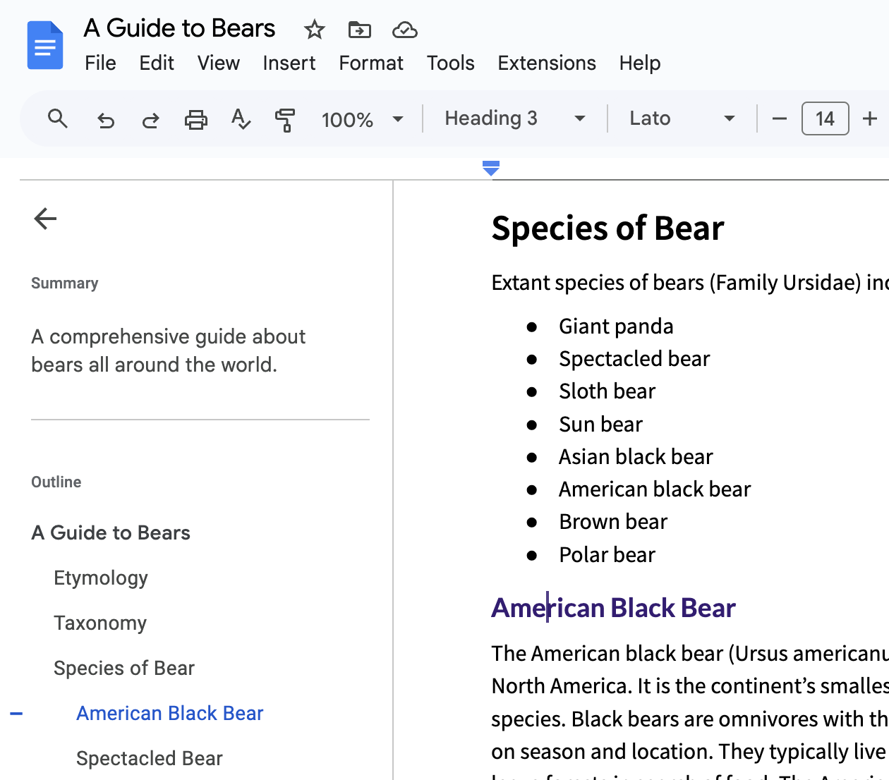
Document Outline
Use the Show Document Outline button to reveal a sidebar that displays all of the headings within the document. You can add a concise summary of your document in the Summary field. The document outline:
- Shows you the hierarchy and organization of the document.
- Functions as a clickable table of contents for easy navigation.
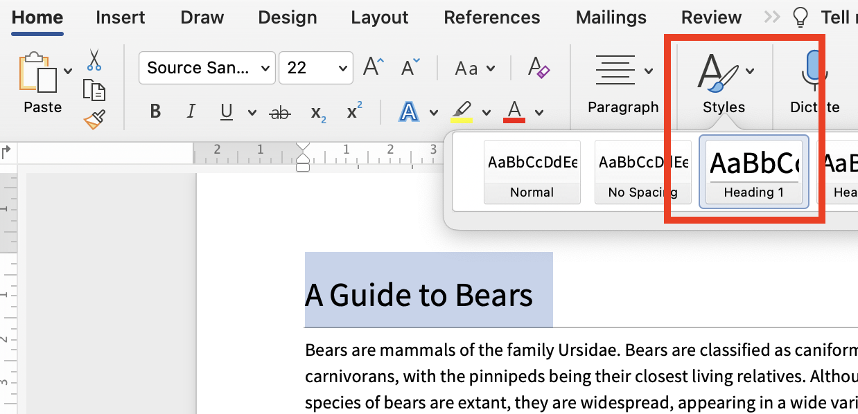
Styles pane
Use the Styles pane within the Home tab to apply semantic headings. Remember to:
- Use a Heading 1 as the main title of your document.
- Note: If a document has a cover page with a duplicate title, it is okay to use the "Title" heading format from the Styles pane.
- Use Heading 2 to Heading 6 for all other subheadings in a meaningful way. Avoid skipping heading levels.
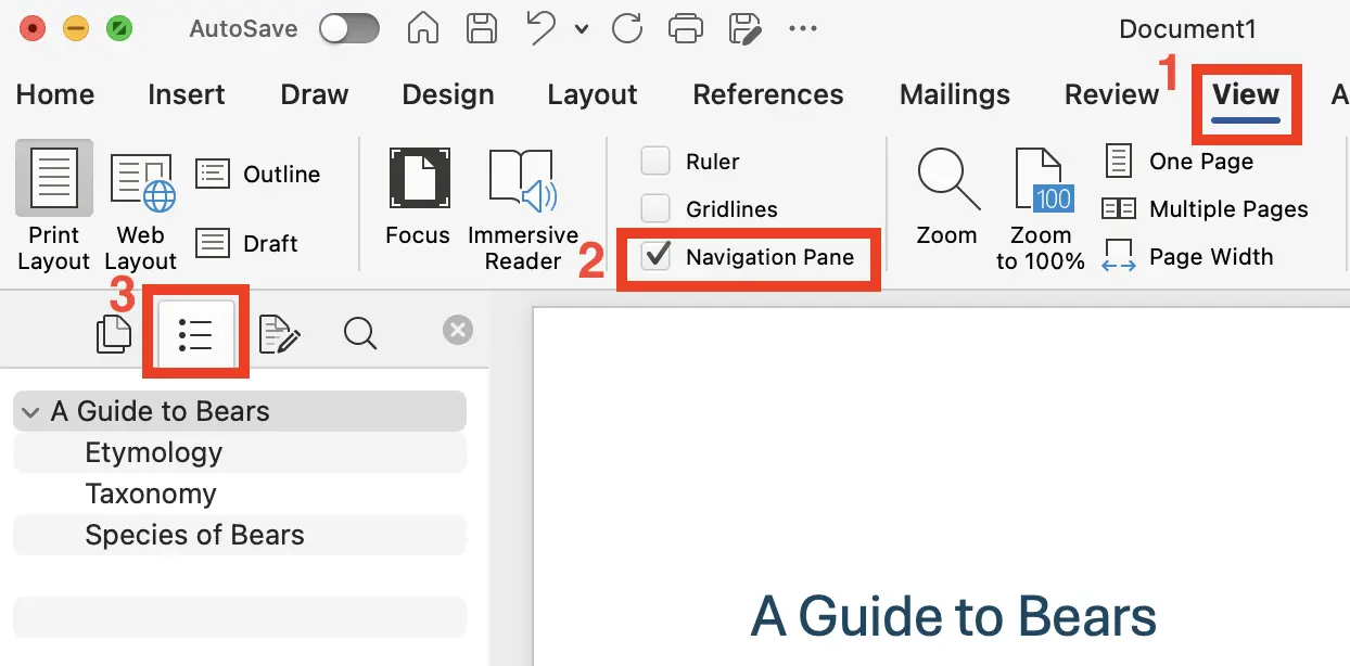
Navigation Pane
The Navigation Pane displays all of the headings within the document. The document outline:
- Shows you the hierarchy and organization of the document.
- Functions as a clickable table of contents for easy navigation.
To display the Navigation Pane:
- Select View.
- Check the Navigation Pane checkbox.
- Select the Document Map tab.
Format button
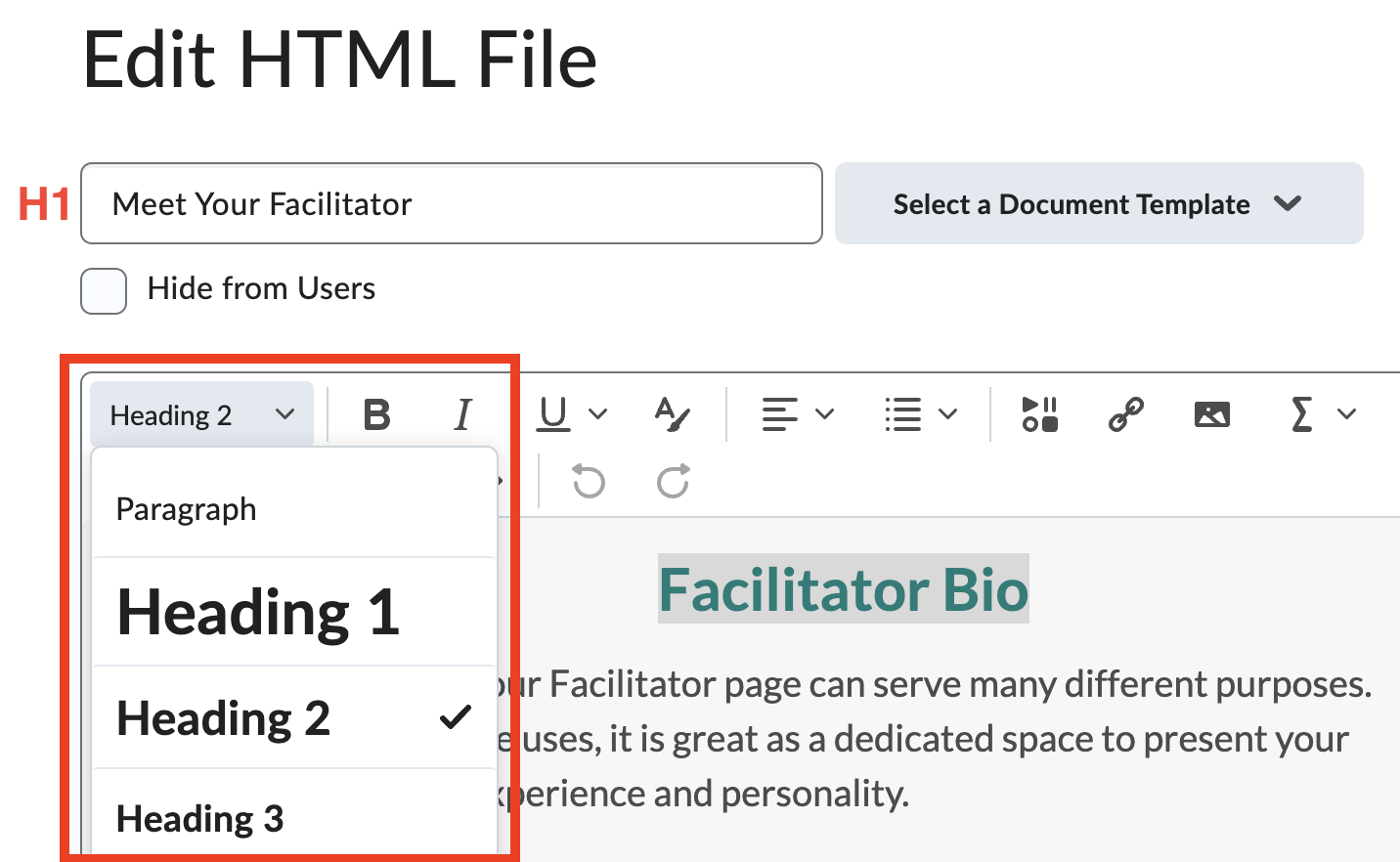
Use the Format button to apply semantic headings.
Some things to keep in mind when creating content within D2L Brightspace:
- When creating a New File, the initial Title field becomes a Heading 1 on the published page.
- Note: Most of the premade Document Templates include a Heading 1 at the start of the main content. This is ok!
- Note: Most of the premade Document Templates include a Heading 1 at the start of the main content. This is ok!
- Use Heading 2 to Heading 6 for all other subheadings in a meaningful way. Avoid skipping heading levels.
Heading block
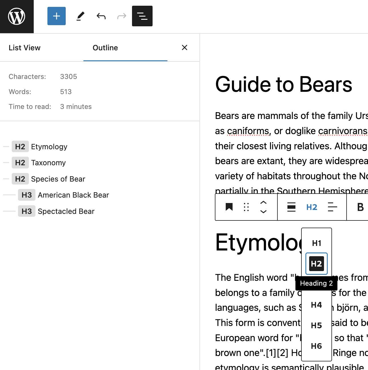
Create new headings using the Heading block. You can also transform existing blocks to a heading. For example, select the Paragraph button within the toolbar, and then select Heading . Use the toolbar to change the heading level of the block.
Some things to keep in mind when creating content within WordPress:
- When creating a post or page, the initial "Add title" field usually becomes a Heading 1 on the published page.
- Use the Document Overview button to view the overall heading structure of the page.
Content editors who manage a blog at TMU (blog.torontomu.ca)
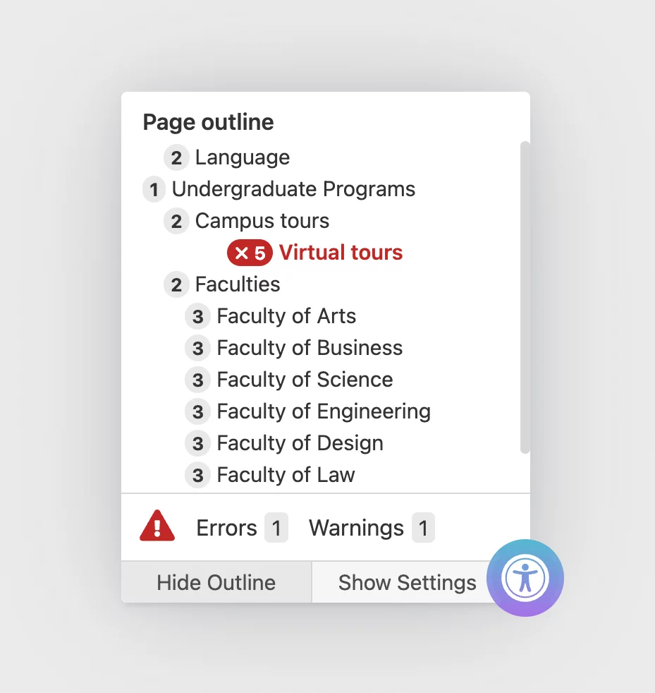
Sa11y is a WordPress plugin (external link) available to all content editors that manage a blog at blog.torontomu.ca. Sa11y helps content editors identify accessibility issues with their content. Sa11y includes a page outline feature similar to Google Docs and Microsoft Word. It can also identify erroneous skipped or empty headings.
When viewing a Post or Page in Preview mode, select the Accessibility Checker button. Then select Outline to view all headings on the page.
Paragraph format button
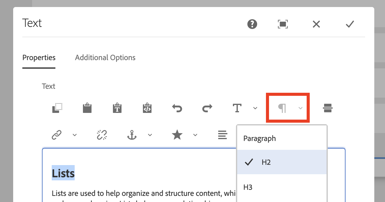
Use the Paragraph format button within the Text Editor to apply headings. AEM has been customized at TMU to facilitate good heading structure:
- The Page Title also becomes a Heading 1 whenever you create a page. Use Headings 2 through 6 to structure remaining content.
- Heading formats can be applied to various components within AEM, such as the Accordion component.
- Use the Accessibility Checker in Preview mode to review the page's heading structure.
For more information that is specific to AEM, please visit the Heading Structure page on the Web Support site.
Lists
Lists are used to help organize and structure content, which helps with readability and comprehension. Lists help convey relationships, sequences, or groups of items efficiently. When using properly formatted (semantic) lists, assistive technologies are able to convey information such as the total number of items and the relative position of each item in the list.
- Use your authoring tool's Bullet or Number formatting buttons to create semantic lists.
- Avoid using special characters, dashes, or manually prefixing paragraphs with numbers to mimic a list of items.
- If you are coding a webpage with HTML, ensure you are using the correct semantic markup for ordered (external link) or unordered (external link) lists.

Further reading
- Applicable WCAG Success Criteria: 1.3.1 Info and Relationships (Level A) (external link) and 2.4.6 Headings and Labels (Level AA). (external link)
- Content Structure (external link) by the W3C's Web Accessibility Initiative.