Images
Alt text for images
Alt text (also known as alternative text) is used to convey meaning and provide context in place of an image. Alt text is read aloud by screen readers, displayed on the page if the image fails to load, and is indexed by search engines.
Alt text should provide a concise description conveying essential information about the image.
Effective alt text
- Describes the image in context. Consider the context of the surrounding information. Think about the "five Ws" — who, what, when, where, and why.
- Concise and meaningful, yet does not compromise on detail for it to make sense. Usually around a sentence or two in length.
- Uses punctuation such as full stops and commas, so it can be read in a more human way by a screen reader.
- Avoids the words "image of" or "photo of" in the description. Screen readers already indicate it is an image.
- Avoids abbreviations, acronyms, and initialisms in the description. It's better to provide the expanded form.
- Consider including identifiers such as race, ethnicity, gender or other identifiers when describing people if: it is relevant to the overall context of the image, and the identities are known. Do not make assumptions or assign people social identities. For more guidance:
- Alternative text: race, gender, and physical descriptions (Make Things Accessible) (external link)
- Cooper Hewitt's guidelines for image descriptions. (external link) Refer to the section titled "Describing people."
How to add alt text
For website developers or content creators who make web content using HTML, please visit W3C's Images Tutorial which includes HTML examples. (external link)
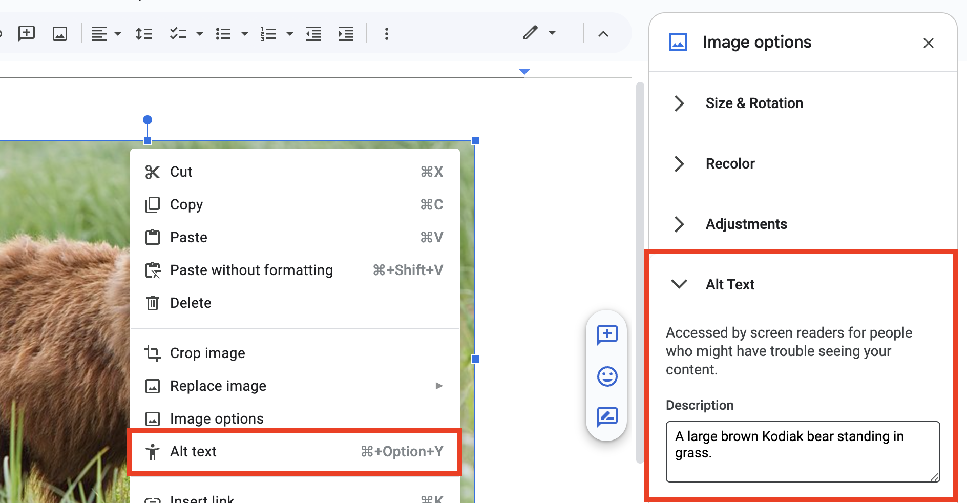
To add alt text in most Google Workspace apps:
- Right-click on an image.
- Select Alt Text from the utility menu. This will open the Image options sidebar.
- Add your alt text to the Description field within the Alt Text section.
Other tips
Limit the number of decorative images. It is not possible to indicate that an image is decorative in Google Workspace.
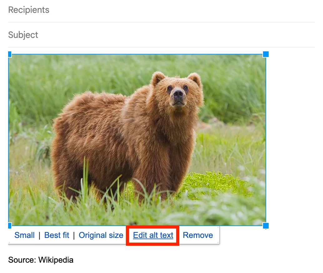
Alt text in Gmail
Select an image, and then select Edit alt text within the toolbar below the image.
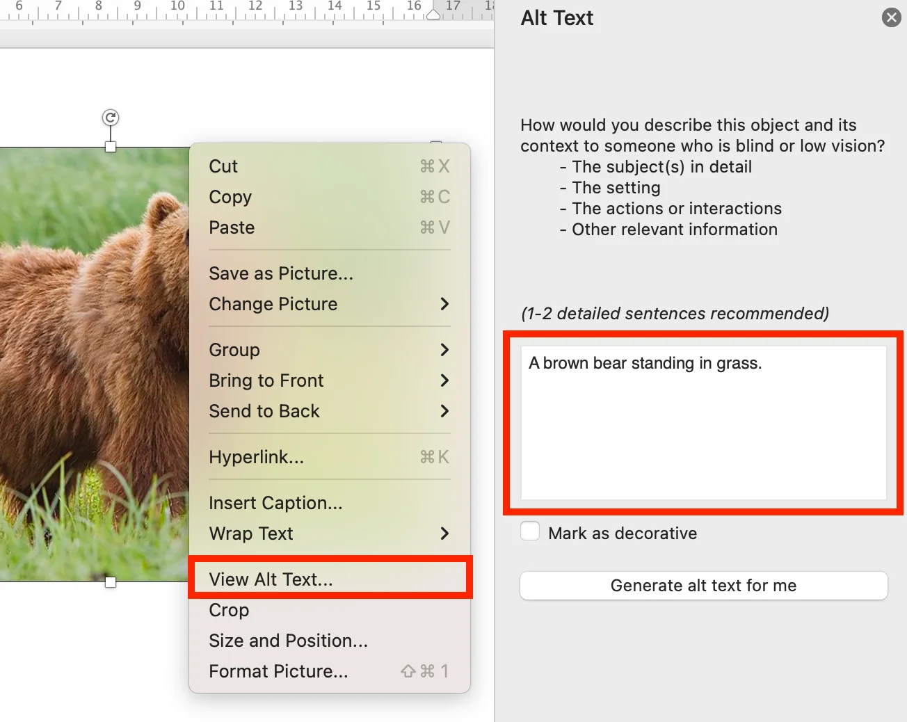
Adding alt text in various Microsoft Office applications will vary across different versions and operating systems.
In most cases, right-click on an image, and select Edit alt text or View alt text.
Other tips
- The "Generate alt text for me" button can be used as a starting point.
- Note: AI tools do not understand intent or context. Be sure to edit the generated alt text for accuracy.
- Images that do not convey any meaningful information (like decorative borders or shapes), select Mark as decorative.
- Use the built-in Accessibility Checker to identify images missing alt text in your document. Go to Tools or Review, and select Check Accessibility.
For more information, please visit:
Alt text via Media Library
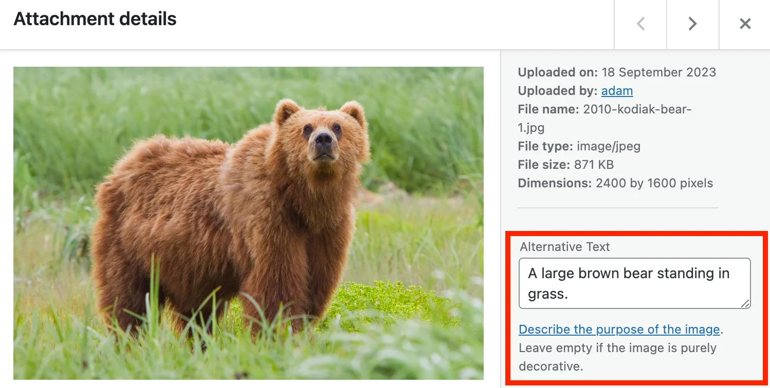
When uploading an image via the Media Library:
- Select an image to open the Attachment details.
- Add your alt text to the Alternative Text field.
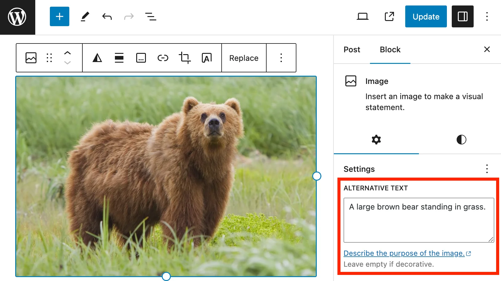
Alt text via block editor
You can also add alt text using the block editor.
- Toggle the visibility of the Settings sidebar.
- Select the image.
- Add alt text to the Alternative Text field.
At TMU, content editors can add alt text to images three different ways in AEM.
- When uploading images to the Digital Asset Bank (DAM) via the Title field.
- Preferred method: This will ensure alt text will be applied globally to that image wherever it is referenced.
- Using the Alt Text Dashboard.
- Preferred method: This will ensure alt text will be applied globally to that image wherever it is referenced.
- At the component level via the Image component's Alternative Text field.
- This method should only be used to overwrite the globally defined alt text. If the alt text does not make sense based on the surrounding page content, provide a new alt text via the Alternative Text field.
For instructions on how to add alt text, please refer to the Alt Text Guide on the Web Support site.
Images that capture a mood
Good alt text: "Excited graduates wearing blue Bachelor’s gowns, waiting to receive their diploma at convocation."
Bad alt text: "Graduates at convocation"
Tip: Context matters. If this image was on a website that sells graduation gowns, the alt text may describe the gowns in more detail.

Logos and brand marks
Good alt text: "Department of Mathematics at the Faculty of Science at Toronto Metropolitan University"
Bad alt text: "TMU math department logo"
Tip: The word "logo" is not necessary or useful as part of the alternative text. There is also no need to provide a literal description of what the logo looks like.

Images with a visible caption
Good alt text: President Mohamed Lachemi holds a baseball in Rogers Centre, standing next to pitcher Erik Swanson and two Blue Jays mascots.
Tip: Avoid duplicating the visible caption text for the alt text. It will be read twice by a screen reader.

TMU president Mohamed Lachemi was invited to throw the ceremonial first pitch at Sunday’s Blue Jays game at Rogers Centre. The Jays went on to win 3-2 against the Boston Red Sox.
Images of people for a biography or team page
Good alt text: Janice Fukakusa
Bad alt text: Portrait of Janice smiling
Tip: Simply use the person's name as the alt text. It is not necessary to include the words "Portrait of" or "Photo of".

Janice Fukakusa is Toronto Metropolitan University's Chancellor.
Images of charts and graphs
For complex images such as charts, math equations, flowcharts, graphs and infographics where the text alternative may be very long — a plain text summary and the source data table may be necessary.

Good alt text: Pie chart of desktop, mobile, and table sessions on torontomu.ca from June 2022 to June 2023. Mobile and tablet sessions account for nearly 50% of all traffic.
Tip: Make sure to capture the data in the chart or graph. Depending on the complexity of the chart or graph, you may need to provide an additional summary and the source data table.
The pie chart shows the percentage of desktop, mobile, and tablet sessions on the torontomu.ca website from June 2022 to June 2023. Mobile traffic is almost on par with desktop, representing nearly 50% of all traffic. This data demonstrates the importance of optimizing digital content for mobile devices. Data retrieved from Google Analytics.
| Device category | Sessions |
|---|---|
| Desktop | 50.9% |
| Mobile | 47.9% |
| Tablet | 1.3% |
Avoid images of text
Always use "real" text instead of placing text inside of an image. Plain, selectable text is much more flexible and accessible. Real text can be resized using the browser without losing clarity.
Content editors and web developers should use Cascading Style Sheets (CSS) (external link) to visually style text to achieve dynamic visual designs.
Problems with images of text
- The text may become too small or very difficult to read on mobile screens.
- More likely to distort and pixelate when resized. At high magnification, the text may look "fuzzy" and sometimes unreadable.
- The text within the image will not scale proportionally when using the browser's magnification features.
- Not selectable (impossible to copy and paste), and won't be accessible for people who use assistive technology unless alt text is provided.
- Cannot translate automatically.
- Not customizable for people with browser preferences or extensions that make it more readable for them.
- If using a dark mode extension, sometimes the image becomes completely unreadable because it blends in with the background.
When images of text are absolutely necessary
- Always provide alt text.
- There should be minimal text within the image. Check if the text is still readable on mobile.
- If the text is longer than a sentence, also reproduce its contents on the page as plain text. For example, provide a text-based version below the image.
- If the text is longer than a sentence, also reproduce its contents on the page as plain text. For example, provide a text-based version below the image.
- Use vector images or SVG (Scalable Vector Graphics). SVGs can easily re-size without degradation and usually have a small file size.
- If using Adobe Illustrator: use the Selection Tool to select the text frame, then go to Type > Create Outlines. Once you are ready to export, go to File > Export > SVG.
- For infographics: provide a text-based version. Create a well-structured web page or link to a document that contains the equivalent information.
- For charts and graphs: provide a brief alt text description for the image and include the original tabular data in a well-structured table.
