Typography
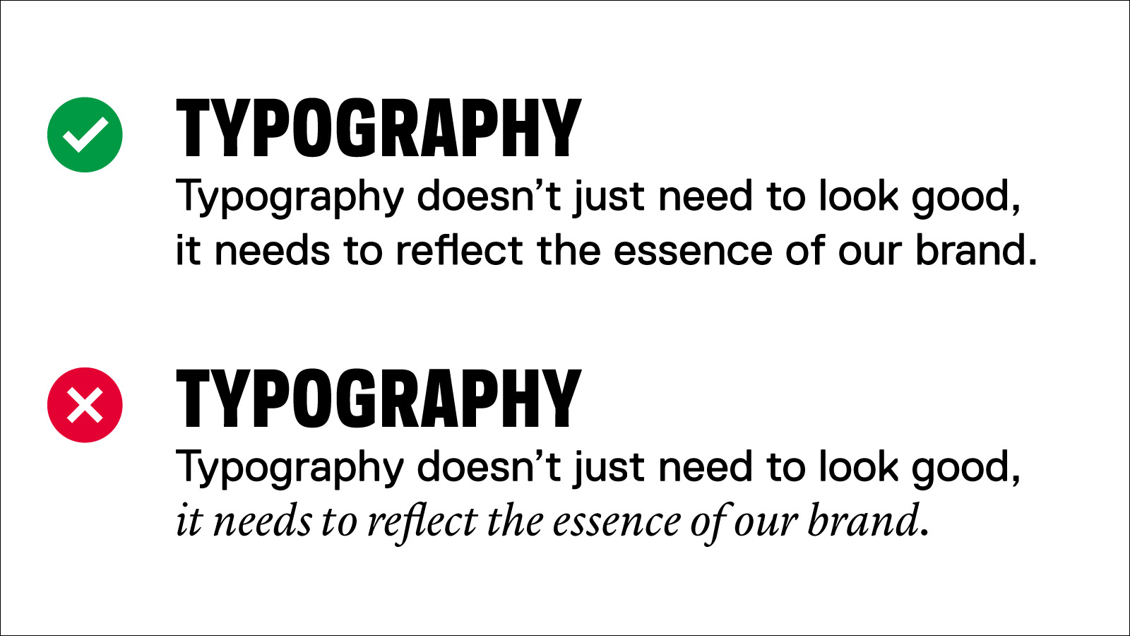
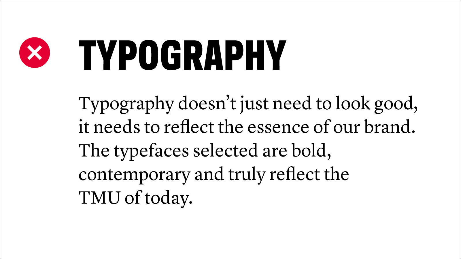
Typography doesn’t just need to look good, it needs to reflect the essence of our brand. The typefaces selected are bold, contemporary and truly reflect the TMU of today.
Purchasing Fonts
To purchase TMU’s brand fonts for your computer, please contact tmubrand@torontomu.ca. Please note that you do not need a license to use these fonts on your website, providing it has been designed in AEM.
Replica Std is the primary typeface of Toronto Metropolitan University. It is the lead typeface used for headlines in all communications, except in formal or convocational material.
Replica Std is designed by using a strict grid, giving it distinct qualities that provide TMU with a bold, confident voice.
Replica Std Bold and Light are used to differentiate levels of information through contrasting weights. Replica Std Regular can also be used as a third weight. Italics are used sparingly.
Alternate Use
Due to the nature of typeface licensing, if Replica Std is not available, then use Arial.
Need to purchase Replica Std for a project? Get in touch with your faculty’s marketing officer or email tmubrand@torontomu.ca to discuss your font needs.

Lyon Text is the secondary typeface of Toronto Metropolitan University. It is used as body copy to complement Replica, enabling more flexibility in typographic messaging.
Lyon Text is a contemporary serif, giving TMU a classic, formal voice when needed.
Although Lyon Text comes with a large font family, it is recommended that Bold and Regular weights are used. Bold Italic and Regular Italic can also be used.
Alternate Use
Due to the nature of typeface licensing, if Lyon Text is not available, then use Times New Roman.
Need to purchase Lyon Text for a project? Get in touch with your faculty's marketing officer or email tmubrand@torontomu.ca to discuss your font needs.

Polaris Condensed is a secondary typeface of Toronto Metropolitan University. It is a compressed sans serif font that provides visual contrast and impact for print and web designs that contain multiple levels of information (eg. Admissions Handbook/annual reports).
It is recommended that Polaris Condensed Book, Medium, Bold and Heavy weights are used. Italics are used sparingly.
Alternate Use
Due to the nature of typeface licensing, if Polaris Condensed is not available, then use Arial.
Need to purchase Polaris Condensed for a project? Get in touch with your faculty’s marketing officer or email tmubrand@torontomu.ca to discuss your font needs.
General Usage
TMU’s typography guidelines are as follows:
- Type is always black or white.
- Headlines are always in sentence case.
- Type is consistently left-aligned with comfortable leading/line height.
- When pairing fonts, use Replica Std as the primary choice and pair it with a secondary font for differentiation or accent (see web usage for exceptions).
- Lyon Text is most effective as body copy when there are large blocks of text.
- Polaris Condensed is most effective for small blocks of text such as quotes, figures, captions and chart headlines.
- Lyon Text and Polaris Condensed are used for publications* and web design to provide visual contrast and enhance readability.
- Avoid using all three typefaces together for a single project.
* A publication is considered to be a document that is 8+ pages and contains multiple levels of information.
.jpg)
Print Usage
- Before using our brand fonts for print medium, make sure you are familiar with our general typography guidelines and how to license them above.
- Replica is used as the headline typeface in a coloured box.
- As an alternative, a headline can also be positioned directly on top of a photo, without using a coloured box, as long as there is enough contrast between the type and the photo.
- For body copy, Replica Std or Lyon Text may be used.
- Polaris Condensed should only be used for publication design where there are multiple levels of hierarchy — it is most effective for small blocks of text such as quotes, figures, captions and chart headlines.
Web Usage
- Before using our brand fonts on your website, make sure you are familiar with our general typography guidelines above.
- Specific weights for each font are available on www.torontomu.ca to maintain consistency.
- Replica Std is used for body copy, photo captions and buttons.
- Polaris Condensed is used for headlines and stats to create impact on the page.
- Lyon is most effective for long blocks of text and should only be used for body copy and not as a headline.

Avoid using "straight" quotes and use “curly” quotes instead.
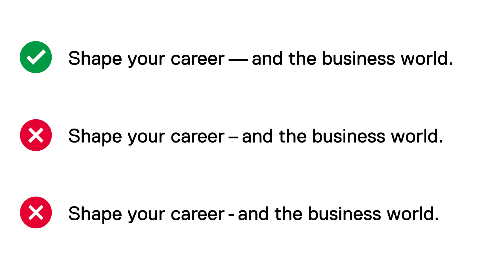
The em dash is used to create a strong break in the structure of a sentence. Hyphens and en dashes are NOT approporiate alternatives for em dashes.
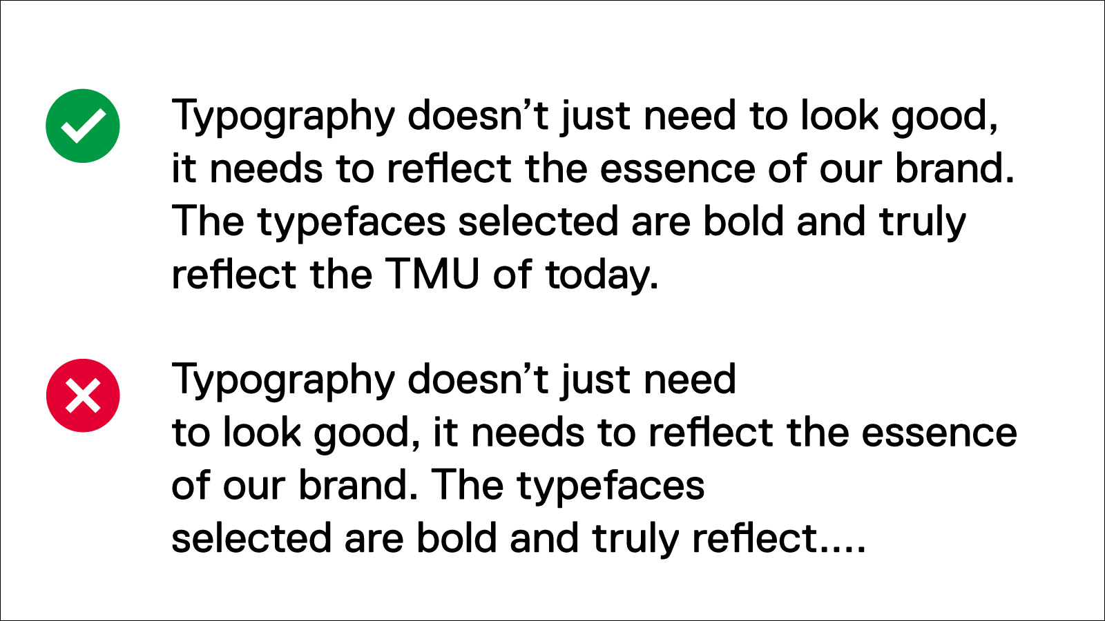
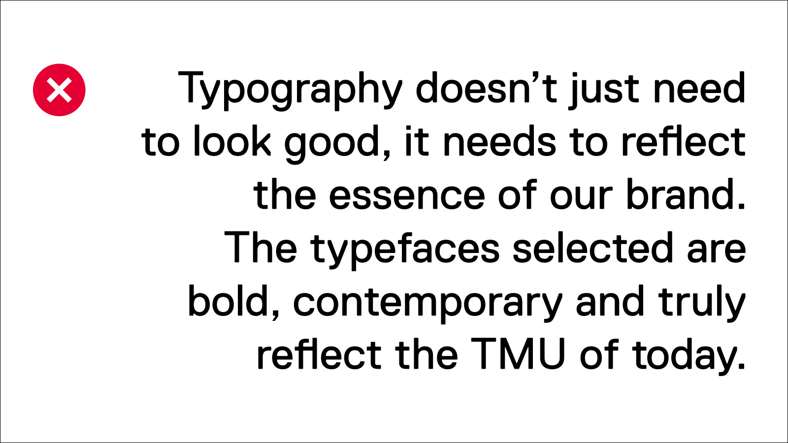
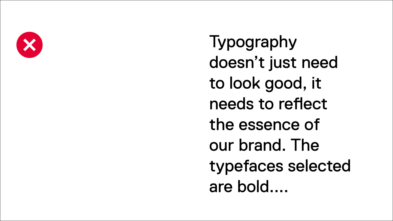
Do not right-align copy.
Font
A specifically designed collection of letters, numbers, punctuation, and other symbols used to set text (i.e. TMU’s font is Replica Std).
Kerning
Increasing or decreasing the space between two consecutive characters in a word by very fine increments.
Leading (or Lines Height)
Amount of vertical space between lines of text in a paragraph.
Rag
The shape created by the ends of each line of text. Recommended line lengths are short- long-short-long, with no hyphens.
Tracking (or Letterspacing)
The uniform amount of spacing between all characters in a complete sentence, paragraph or page.
Widow
When the last line of a paragraph only contains one word, that word is considered a ‘widow’ — these are undesirable and should be avoided.
Baseline
An invisible line upon which letters or lines of type sit/rest.