Refreshed look for Google Drive
May 23, 2018
Google Drive is getting a new look and feel when accessing it through the web. There are no changes to how you use Google Drive, just visual tweaks and some buttons have been moved.
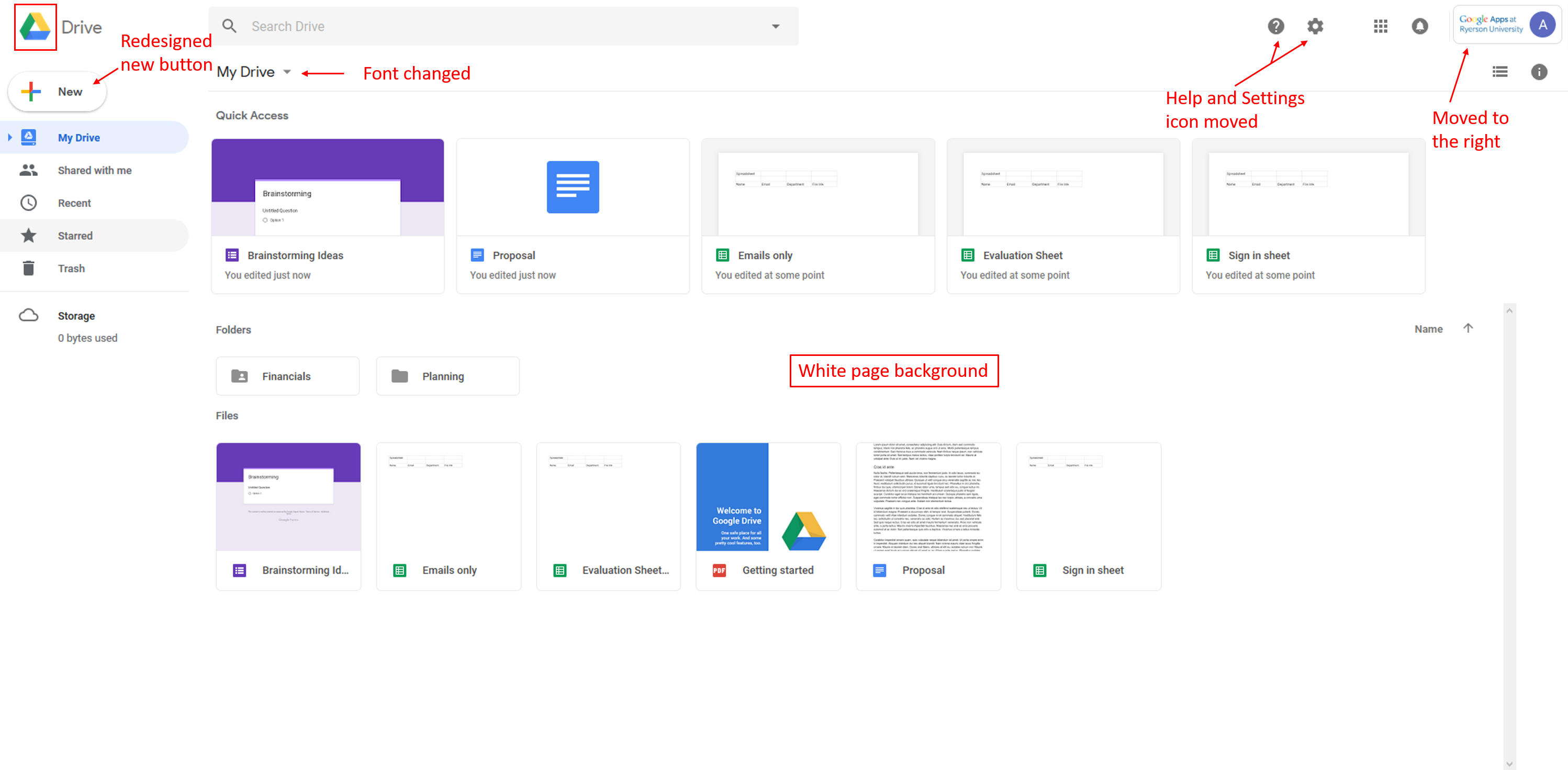
Changes coming to Google Drive interface on the web:
- The logo in the top left has been changed to the Google Drive logo.
- The "Google Apps at Toronto Metropolitan University" logo will move to the top right.
- The Settings icon has been moved in line with the search bar.
- The Help Center icon has been moved in line with the search bar.
- The page background is now white, not gray.
- The “New” button has been updated.
- The font used for headers has been changed.

Changes coming to the Google Drive UI.